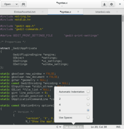
This popover belongs to the status bar of gedit. It contains two checkboxes and a radio button.
A popover is a container-type graphical control element that hovers over its parent window and blocks any other interaction with until it is selected. It can contain various other graphical control element such as checkboxes, radio buttons or a list box. Like any container-type graphical control element, it is meant to group elements that belong together and is not meant to be extensive.
Popover graphical control element were introduced in GTK+ 3.12[1]
References
- ↑ "Popovers in GTK+". 2014-01-22. https://blogs.gnome.org/mclasen/2014/01/22/and-now-popovers/.
Widgets (List of …) |
|---|
| Command input |
- Adjustment handle
- Button
- Context menu
- Drop-down list
- Hamburger button
- Menu
- Pie menu
|
|---|
| Data input-output |
- Checkbox
- Color picker
- Combo box
- Cycle button
- Date picker
- Grid view
- Light switch
- List box
- List builder
- Radio button
- Scrollbar
- Search box
- Slider
- Spinner
- Text box
|
|---|
| Informational |
- Balloon help
- Head-up display in computing
- Head-up display in video games
- Icon
- Infobar
- Label
- Loading screen
- Progress indicator
- Progress bar
- Splash screen
- Throbber
- Sidebar
- Status bar
- Toast
- Tooltip
|
|---|
| Containers |
- Accordion
- Tree view
- Client-Side Decoration
- Disclosure widget
- Frame/Fieldset
- Menu bar
- Panel
- Popover
- Ribbon
- Tab
- Toolbar
- Window
- Workspace
|
|---|
| Navigational |
- Address bar
- Breadcrumb
- Hyperlink
- Navigation bar
- Virtual desktop
|
|---|
| Special windows |
- Alert dialog box
- Dialog box
- File dialog
- Inspector window
- Modal window
- Palette window
|
|---|
| Related concepts |
- File viewer
- List of graphical user interface elements
- Layout manager
- Look and feel
- Mouseover
- Widget toolkit
- WIMP
|
|---|
 | Original source: https://en.wikipedia.org/wiki/Popover (GUI). Read more |