InkStitch - data visualization
 From EduTechWiki - Reading time: 11 min
(Written in 2018)
Data visualization embroidery[edit | edit source]
Various types of charts have the potential for embroidery. We will explore this a bit over the next few weeks and months. We shall focus on rendering the graphics part. Please ignore the ugly lettering since we do not have time to copy/past individual digitized letters.
InkStitch has functionality for creating embroidery visualizations fairly rapidly since several data visualization software can export to SVG. The only major caveat as of Aug 2018 is that InkStitch does not have a lettering module. Letters should be stitched with satin stitches. [Edit: As of 2024, lettering this and other technical problems are no longer an issue]
After a short feature comparison of various charting software, we started doing tests with Highcharts, a popular entry-level charting library that requires coding, but no programming skills. These explorations are documented below. We show designs and solution that are not necessarily optimal, but nevertheless interesting in one way or another. That being said, we believe that interesting visualization should be inspired from traditional embroidery designs. We will explore this in the future.
See also: Physical visualization and a data visualization with machine embroidery workshop program (Dagstuhl 2018).
Creating charts with Highcharts[edit | edit source]
Highcharts is a JavaScript library to create various types of charts. [Quote]: “Highcharts is a SVG-based, multi-platform charting library that has been actively developed since 2009. It makes it easy to add interactive, mobile-optimized charts to your web and mobile projects. It features robust documentation, advanced responsiveness and industry-leading accessibility support.” (Highcharts, Aug 2018). It is free for non-commercial use. There is an export function to SVG.
To create SVG for embroidery two strategies can be combined:
- Adapt the source (both the JS and the CSS code)
- Edit the resulting SVG
It probably is best to start from a demo then either export the code or export it to codepen or jsfiddle.
There exist two ways of styling Highcharts. One version uses the JSON attributes, i.e. the same data structure that isused to configure the chart. The other one uses CSS. Both APIs are documented in the Highcharts JS Options Reference. Make sure to load the right library !
Styles are defined in the JSON code
<script src="https://code.highcharts.com/highcharts.js"></script>
<script src="https://code.highcharts.com/modules/exporting.js"></script>
Styles are defined in the CSS:
<script src="https://code.highcharts.com/js/highcharts.js"></script>
<script src="https://code.highcharts.com/js/modules/exporting.js"></script>
@import 'https://code.highcharts.com/css/highcharts.css';
Creating a bubble chart without editing JavaScript[edit | edit source]
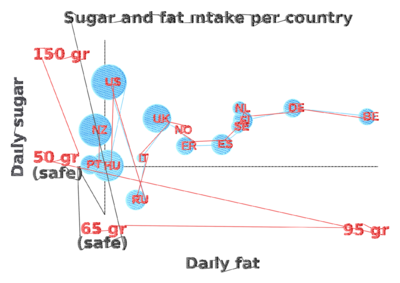
We exported the SVG from the high charts demo and then edited the SVG code. Please do not reuse this data without crediting highcharts.com and do not use it for commercial purposes.
We did the following.
- Delete all the elements we did not want, in particular grids.
- Simplify x/y and global labels and put all of these into a single group. Within this group ungroup all subgroups.
- Remove strokes from labels and add fill
- Set font size to 24 pt or bigger (that will create 6mm fonts for Capitals). To me it is not clear if there is a standard size for "pt". I assume that 1pt = 0.35mm. Font size is probably bigger than Capital letters, else this does not work. (0.92.3/Ubuntu 18).
- Adjust size and layout for your favorite hoop, e.g. 180 X 13cm for a Brother PRH180.
- Convert all text objects to paths after that.
- Make sure that all the bubbles are in the same group, set fill and remove stroke.
- Make all lines dotted (for Ink/Stitch to create lines)
- Order the groups. Text should be on top. Strokes at the bottom, followed by bubbles.
- Verify the colors ! (initially, the SVG below has too many which is a problem on a single needle machine)
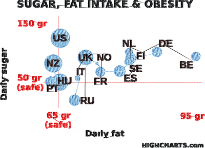
Parameterize most objects for a simple fill, rotate fills for the bubbles, dotted lines can be stitched with a bean stitch.
The design takes a fairly long time to process. To speed up computing you could select individual letters (one by one) and simplify (CTRL-L).
 |
 |
 |
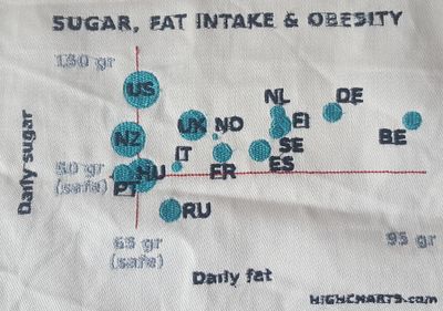 |
The result could be improved in several ways (most of this is done in the SVG for download above).
- Better tissue and stabilizer. I used a cheap napkin with a tear-off stabilizer.
- Replacement of fill fonts with digitized satin fonts, but that is too much work at this stage of exploration.
- Making the title and labels a bit bigger
- Rotate stitch direction of bubble fills
- Line underlay for labels (cannot be done)
Tuning with JavaScript[edit | edit source]
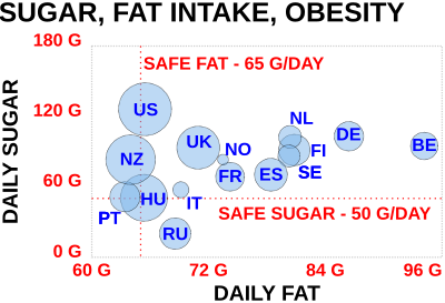
Instead of editing the exported (default) SVG, you also could generate a modified version. Open the Demo in CodePen.io. If you want to play with the bubble chart, you can also start from our modified version:
- https://codepen.io/danielkschneider/pen/NBQjGg
- A probably older version of the code is available in InkStitch - data visualization/highcharts-bubble-js-code
Firstly, have a look at the API. It defines all the parameters that can be set in the JSON structure defining the chart.
Below are a few of the changes we made:
Setting the size:
- Modify the HTML code. E.g. for a 18cm x 13cm hoop, use:
<div id="container" style="height: 128mm; width: 178mm"></div>
- Modify also the SVG code (but you only can enter pixel and % values)
   width: 670, //pixels only. That will be DPI dependant.
   height: "72%"
Change fontSize, fontWeight and color. In this version one cannot use CSS styles in a simple way. Instead, I used JavaScript CSS styling. E.g.
 title: {
      text: 'DAILY FAT',
      style: {"fontSize":"25pt", "fontWeight":"bold", "color": "#000000"}
    },
Shorten phrases and words and capitalize all text. E.g. "G" instead of "gr".
Changed axis "ticks" (four for both axes)
Augment the size of the bubbles a bit in the plotOptions:
bubble: {minSize:"5%", maxSize:"25%"}
The resulting SVG still needs hand editing and regrouping of objects, but requires much less work. Read aboves. In short:
- Regroup similar objects in a same group, then ungroup all the objects in the group
- Remove stroke from all objects (!!). You could leave a dotted stroke for the bubbles.
- Transform text and rectangles to object
- Reorder groups if needed
- Parameterize for embroidery. Bubbles should have an other stitch direction than overlapping text. I also suggest using an underlay, although it could make the embroidery a bit stiff.
Result
 |
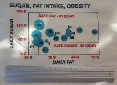 |
The stitched result is better than the our first attempt documented in the previous section. The lettering is still ugly but a bit more readable. We either used an underlay or we stitched them twice using the controls of the embroidery machine. Maybe stitching twice with a different fill direction also could help. The borders have quite an ugly zigzag stitch that could be replaced by nothing or a bean stitch in a different color.
Line Charts[edit | edit source]
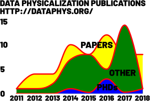
Line charts are fairly easy to create, unless you plan to color the area underneath
- Line Chart Code pen example that you could fork and modify
- Stacked Area Chart with the same data
- Data collection of academic work on data physicalization
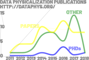
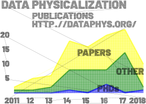
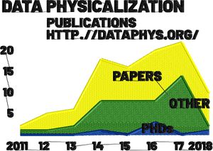
Since an area plot of a line chart will have overlapping zones, we create a light-weight fill using the hatching functionality from the eggbot extensions. We also show an area chart where volumes are stacked. As you can see, the y axis is longer for the same data.
Lines that are translated to proper satin stitches will look better (green and blue line below)
Font are ugly and should be converted to satin stitches, but that takes too much time for our testing purposes that concern stitching chart graphics.
Results
 |
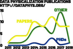 |
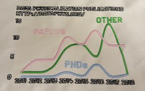
The stitched result is sort of acceptable. The lines come out really well, the lettering using bean stitches for strokes (as opposed to fills) is about as ugly as filled letters. I had thread problems twice (once for the "T" in DATA" black and once for the pink).
Alternatives:
 |
 |
 |
 |
Area Charts[edit | edit source]
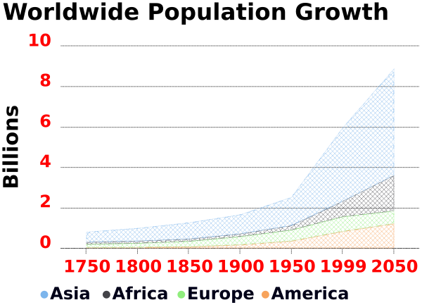
Area Charts allow visualizing and comparing volume over time. On a linear scale they work best for a few not too different cases.
- Historic and Estimated Worldwide Population Growth by Region (Original at Highcharts)
- Code Pen example that you could fork and modify
- InkStitch - data visualization/highcharts area chart
In the JSON code, we modified font sizes and shortened the title. We also removed Oceania
In the exported SVG we did the following:
- Lower the labels (cannot be done in JS ?)
- Removed "Highcharts.com" (is that compliant with the free education license ?)
- Removed 3-4 rectangles, invisible x lines, and an empty text.
- Removed empty path from the area charts.
- Add stroke and dashes to lines, remove fill color
- Remove stroke and add fill to texts, transform to paths.
Notice: "Undefined color" should be rendered in black, so "undefined" does not mean "removed" !
Dealing with areas:
Filling large areas with a tatami pattern could make the whole embroidery a bit stiff. Lowering its density could help but is not very pretty.
- Remove the separating lines
- Set stroke (same color as the fills) and remove the fills.
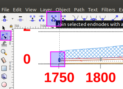
- Since the areas are open to the left, you will have to close them. Hit F2, select the two nodes and "join selected endnodes with a new segment".
- Use a fill pattern made with Inkscape as explained in the InkStitch - fills with programmable stitches.
- Transform strokes of the fill patterns and border into dotted lines
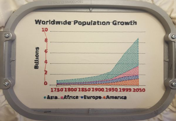
Embroidery
- I stitched the lettering twice. It doesn't look good, but still better than stitching it once. Setting an underlay did crash Ink/Stitch (version 16.0). This may be related to the cross-stitch code.
- We tested using lower cases letters. They do not look very good.
Pie charts[edit | edit source]
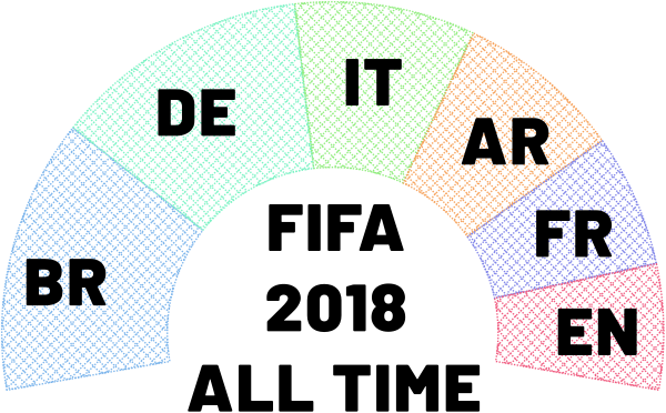
This time, we decided to modify the CSS, as opposed to use JSON style properties. Of course, we also made changes to the latter. We started from this and then added our own data, i.e. FIFA all time world cup rankings.
- https://codepen.io/danielkschneider/pen/QVwYYd
- A probably older version of the code is available in InkStitch - data visualization/highcharts-pie-charts-js-css-code
Modifications to the HTML code:
- Since we use CSS for styling, the library must be changed, i.e. instead of using
https://code.highcharts.com/highcharts.js, we usehttps://code.highcharts.com/js/highcharts.js, i.e. notice the extra "js/" in the URL. - We also imported a font from google that has extra-bold and straight feet. It does not show in our browser, but exports OK. Make sure to install this font on your system, so that InkScape can use it. Read InkStitch - lettering.
CSS code:
- Import the CSS Highcharts library
- We just changed the font family, size and weight for the title and the labels
Modifications to the JS:
- We added our own data (source: Wikipedia
- Changed positioning of the labels
- Made the half-circle bigger (start and endAngle = 100)
Modification to the SVG
- Removed all empty/useless elements
- Adjusted document size
- Position text
- Translate text to paths
- Parameterize for stitching
- Fill the areas, make all lines dotted.
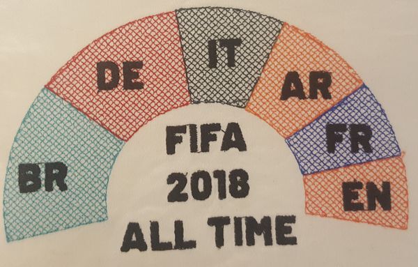
Embroidery
The design was stitched on a cheap napkin using a water soluble stabilizer in the back. Post processing: Rinsing in hot water, removing of most jump stitches, heat press. The fill fonts look a bit better than in the examples above, for two reasons: There is an underlay and the fonts are bigger (h=12mm/45px/34pt). Width of "I" is 3.2mm.
Heat Maps[edit | edit source]
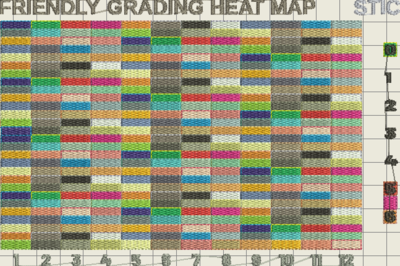
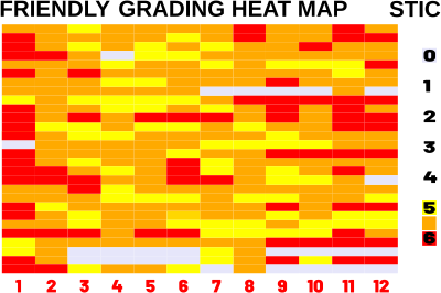
Heat Maps can be attractive for visualizing a larger amount of data. Our example is not that great. We will visualize a gradebook for 28 students doing 12 assignments.
- https://codepen.io/danielkschneider/pen/MqwPOj
- A probably older version of the code is available in InkStitch - data visualization/highcharts-heatmap-js-code
Modifications made to the SVG output
- Removed useless rectangles and other path
- Replaced the gradient legend by some little squares
- Changed the font to Barlow ultra-fat
- Transformed rectangle borders to dotted
- Translated rectangles and fonts to paths
Result
The design below has > 70'000 Stitches and the Brother PR2015X cannot stitch that ("data volume is too large for this pattern" message), which is a bit surprising since this is not a large volume with respect to other design and fabrication files. Also the manual (p. 149) says:
- Embroidery data larger than 200 mm (H) × 360 mm (W) (approx. 7-7/8 inches (H) × 14 inches (W)) cannot be used. (All patterns must be within the 200 mm (H) × 360 mm (W) (approx. 7-7/8 inches (H) × 14 inches (W)) pattern field size.)
- .pes files saved with the number of stitches or the number of colors exceeding the specified limits cannot be displayed. The combined pattern can not exceed a maximum number of 500,000 stitches or a maximum number of 127 color changes (Above numbers are approximate, depending on the overall size of the pattern).
Maybe there are too many color changes or maybe I will have to save to PES (currently broken as of aug 2018)
 |
 |
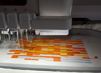
Since the above solution seems to be heavy for Ink/Stitch version <= 1.18, I then made a lighter version without out border running stitches. I also sorted the colors.
 |
 |
Datavisualization through highcharts[edit | edit source]
As a conclusion we can say that Highcharts allows creating a variety of interesting data visualizations.
In order to make these look better, one would have to change create satin stitches for the letters, which would take some extra time. There are two strategies. (1) Keep the stroke of each glyph and translate to rails (2) Replace the text with a digitized font. Alternatively, use at least large and fat font. E.g. Barlow 30pt extra-bold works quite well. Roboto extra-bold (black) also should work fairly nicely.
Recommendations:
- Making changes on the Highcharts side is faster if you are able to read the API, i.e. export graphics that need minimal editing (which still will take some time) in Inkscape
- Use letter size of 30pt if you do not transform these to satin stitches
- Use capital letters and a wide, extra bold font
- Create graphics with few cases (simpler is better). Dealing with many rectangles requires time or a very good computer and stitching many rectangles will take a lot of time.
- Eggbot hatching fill patterns look quite well and allow stitching large surfaces easily.
- For lines, use bean stitches or repeated simple stitches (2-3x)
- Colors should be sorted in charts with many objects, e.g. a heatmap. Read InkStitch - tips and trouble shooting
Trouble shooting
Sometimes Ink/Stitch will not be able to create the stitches for an object.
- Try breaking it apart (Menu Path -> Break apart). E.g., I had to do this with a ":"
- You also may have to recreate a hole using the Path -> Difference operator, e.g. I had to do this with a "6".
Links[edit | edit source]
Ignore these for the moment. We are just in the process of finding a suitable way to create SVG files. - Daniel K. Schneider (talk).
Visualization software[edit | edit source]
D3[edit | edit source]
D3 is a JavaScript library for programmers that can generate SVG
- Getting Started with Data Visualization — Build Your First Chart With D3.js
- VEGA is a visualization grammar built on top.
- Vega-Lite is a high-level grammar of interactive graphics. It provides a concise JSON syntax for rapidly generating visualizations to support analysis
RawGraphs[edit | edit source]
RAWGraphs is an online application that can generate visualizations from tabular data (e.g. spreadsheets).
The generated SVG requires some work that should be done partly with a programming editor.
- Remove grid lines (optional)
- Make some labels bigger, and remove some
- Translate all text to path
- Remove opacity (alpha values to 100%)
Google charts[edit | edit source]
High charts[edit | edit source]
- https://www.highcharts.com/ (commercial, but free for non-commercial use)
So far, the most convenient SVG output to deal with. In the bubble and line charts, data (bubbles or lines), data labels, and other information are in different groups and therefore not too difficult to manipulate.
Data collections[edit | edit source]
Visualizations[edit | edit source]
At Etsy[edit | edit source]
The following could inspire some designs. E.g. on could stitch a real distribution on top of the statistical model theoretical one.
Nausica Distribution (via Etsy) sells a number of embroidered or otherwise marked up textile objects. E.g
- ABC's of Statistics Baby Blanket
- ABC's of Statistics Burp Cloth
- Collection of 10 Distribution Plushies
- Chisquareatops T-Shirt
Bibliography[edit | edit source]
- He, T., Isenberg, P., & Isenberg, T. (2023). Data Embroidery with Black-and-White Textures. arXiv preprint arXiv:2309.02864. https://www.researchgate.net/publication/373714923_Data_Embroidery_with_Black-and-White_Textures/fulltext/64f93dc205a98c1b63f7d6ba/Data-Embroidery-with-Black-and-White-Textures.pdf
- K. Wannamaker, W. J. Willett, L. A. Oehlberg, and S. Carpendale. Data embroidery: Exploring alternative mediums for personal physicalization. In Posters at IEEE VIS, 2019. Extended abstract and poster. http://hdl.handle.net/1880/110218
- J. Zhang. Hacking social media to tell meaningful data visualization stories: Exploring anxiety with embroidery. Blog post: http://janezhgw.medium.com/hacking-social-media-to-tell-meaningful-data-visualization-stories-exploring-anxiety-with-4ff29a8d79e2
- Daniel K. Schneider (2018). InkStitch - data visualization. EduTech Wiki, A resource kit for educational technology teaching, practice and research. Retrieved 21:09, June 13, 2024 from https://edutechwiki.unige.ch/en/InkStitch_-_data_visualization
 KSF
KSF