Methodology tutorial - exploratory data analysis
 From EduTechWiki - Reading time: 10 min
This is part of the methodology tutorial (see its table of contents).
Introduction[edit | edit source]
This tutorial will provide a short introduction to exploratory data analysis (EDA), multi-variate data reduction and related subjects. We will focus on:
- Looking at distributions
- Uncovering structure (both in variables and population)
There exist many techniques, here we plan (to be confirmed!) boxplots, cluster analysis and Factor Analysis (principal components).
- Learning goals
- Be able to select a procedure for exploratory data analysis
- Understand the use of principal component and cluster analysis for exploratory purposes.
- Understand the purpose of repertory grid technique.
- Prerequisites
- Methodology tutorial - descriptive statistics and scales
- Methodology tutorial - quantitative data analysis
- Moving on
- none
- Level and target population
- Beginners
- Quality
- Under construction , use with care !!
In this tutorials we only will provide a high-level overview. Details about multivariate techniques such as factor analysis and cluster analysis are outside the scope of this introduction. We also should mention that many additional multivariate statistical techniques exist, both for exploratory and confirmatory inferential statics.
Exploratory data analysis can be defined as a set of techniques but also as a spirit.
According to NIST handbook,
exploratory Data Analysis (EDA) is an approach/philosophy for data analysis that employs a variety of techniques (mostly graphical) to
- 1. maximize insight into a data set;
- 2. uncover underlying structure;
- 3. extract important variables;
- 4. detect outliers and anomalies;
- 5. test underlying assumptions;
- 6. develop parsimonious models; and
- 7. determine optimal factor settings.
According to Wikipedia and referring to Tukey,
the objectives of EDA are to:
- Suggest hypotheses about the causes of observed phenomena
- Assess assumptions on which statistical inference will be based
- Support the selection of appropriate statistical tools and techniques
- Provide a basis for further data collection through surveys or experiments
Use of simple descriptive statistics[edit | edit source]
Summary tables[edit | edit source]
As a first step you simply should list all your variables and print out the main descriptive statistics. E.g. for quantitative variables
- Mean
- Standard deviation
- Median
- Minimum and maximum
- Skew and kurtosis
Boxplots[edit | edit source]
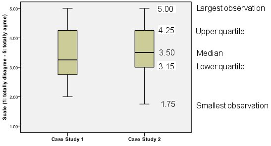
A boxplot is an efficient method of graphically displaying numerical data. It depicts the following information: the smallest observation (sample minimum), the lower quartile (25%), the median (50%), the upper quartile (75%), and the largest observation (sample maximum). If there are outliers, the boxplot indicates them as well. The box is constructed from the bottom, lower quartile to the top, upper quartile. The whiskers connect the box to the smallest and largest values that are not outliers.
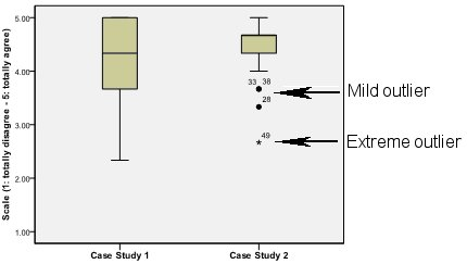
In a normal distribution, the entire sample is represented in the whiskers. Outliers - either extreme or mild – are observations that are distant from the rest of the sample. They are not represented in the whiskers. Extreme outliers are observations that lie outside the box at a distance of more than three times the Inter-Quartile Range (IQR: the difference between the third and first quartiles); they are indicated in the figure by a star. Mild outliers are observations that lay more than 1.5 times the IQR from the first or third quartile but not as far as extreme outliers; these are indicated in the figure by a dot.
To interpret a boxplot, the researcher looks at the numerical values of the three quartiles, representing respectively 25 percent, 50 percent and 75 percent of the sample. S/he also looks at the general shape of the box and whiskers for indications of symmetry or asymmetry and outliers. According to Benjamini (1998, p. 257), a boxplot represents five summaries of the data and allows to identify five crucial informations at simple glance: location, spread, skewness, and longtailedness. Location is displayed by the cut line at the median (as well as by the middle of the box). Spread is defined by the length of the box (as well as by the distance between the ends of the whiskers and the range). Skewness is defined by the deviation of the median line from the center of the box relative to the length of the box (as well as by the length of the upper whisker relative to the length of the lower one, and by the number of individual observations displayed on each side). Longtailedness is the distance between the ends of the whiskers relative to the length of the box (as well as by the number of observations specifically marked).
We recommend using boxplots in design and innovation studies, e.g. to present user opinions about a new course design using a technological environment) or to present objective data extracted from log files or the portalware’s database.
Example: Barbara Class, Study of a blended socio-constructivist conference interpreters trainers training course empowered by an activity based, collaborative learning environment, PhD Thesis (draft). TECFA, University of Geneva, 2008.
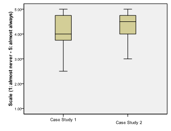
This boxplot shows that in case study 1, the distribution is high regarding a tutor support index we shall not explain here. It varies between 2.50 (halfway between disagree and somewhat agree) and 5 (totally agree). The typical learner agrees (median=4) that teaching staff stimulated and encouraged him/her in his/her learning enterprise. In Case Study 2, the general shape of the boxplot is the same but distribution is less important. For both case studies, whiskers are asymmetrical, the lower whisker being much longer than the upper one, observations are negatively skewed. E.g. In case study one, results show that 25% of learners rather disagree, 25% totally agree and 50% agree that teaching staff stimulated and encouraged them in their learning enterprise.
Cluster Analysis[edit | edit source]
- Cluster analysis or classification refers to a set of multivariate methods for grouping elements (subjects or variables) from some finite set into clusters of similar elements (subjects or variables). A typical use case would be the classification of students into 4 to 6 different groups with respect of their use of ICT tools for their studies.
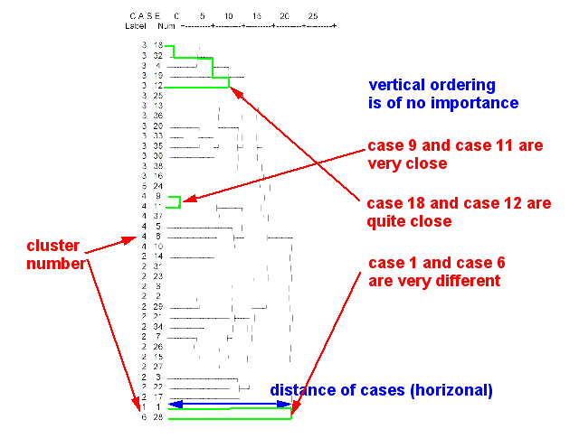
There different kinds of cluster analysis. The most popular are : hierarchical cluster analysis and K-means cluster. Hierarchical cluster analysis tries to identify similar cases in progressive steps. It allows producing a dendogram (tree diagram of the population). A dendogram shows proximity (distance) of cases.
- Hierarchical cluster analysis
Tries to identify similar cases in progressive steps. This procedure allows to produce a dendogram (tree diagram of the population)
- Example
- classification of teachers
- A hierarchical analysis of 36 survey variables allowed to identify 6 major types of teachers with respect to ICT use:
- Type 1 : The "convinced teacher" (l’enseignant convaincu)
- Type 2 : The "active teacher" (les enseignants actifs)
- Type 3 : The "motivated teacher working within a bad environment" (les enseignants motivés ne disposant pas d’un environnement favorable)
- Type 4 : The "willing but not ICT-compentent teacher" (les enseignants volontaires, mais faibles dans le domaine des technologies(
- Type 5 : The "ICT-competent teacher unwilling to use ICT in the class" (l’enseignant techniquement fort mais peu actif en TIC)
- Type 6 : The "Willing and relatively weak in ICT teacher" (l’enseignant à l’aise malgré un niveau moyen de maîtrise)
In order to come up with such labels like "convinced teacher" you have to list the means of all cluster variables and use your imagination.
Most teachers belong to type two and type three. Types 1,5 and 6 only include one teacher. In order to come up with labels such as the "convinced teacher" you will have to list the means of all cluster variables for each type and then use your imagination. The descriptive statistics for some of the 36 variables used for analysis is presented below. Numbers represent means for each type.
| Types [number of teachers] | ||||||
| 1 [1] | 2 [15] | 3 [14] | 4 [6] | 5 [1] | 6 [1] | |
| Importance attributed to student collaboration and help tools | 4.7 | 2.1 | 1.5 | 2.9 | .0 | 5.0 |
| Importance attributed to student communication tools | 4.0 | 2.4 | 1.7 | 2.7 | 1.0 | 4.3 |
| Effects of computer use to prepare and manage teaching | 3.0 | 2.9 | 2.2 | 2.8 | 2.3 | 2.3 |
| Importance of ICT use in the classroom | .0 | 2.7 | 1.9 | 2.3 | 1.0 | 3.0 |
| Advanced computer hardware that teachers own at home. | .5 | .8 | .4 | .3 | 1.0 | .0 |
| Level of ICT competence in documentation and communication tools | 2.3 | 2.6 | 2.3 | 1.7 | 3.0 | 1.8 |
| Variety of learner activities | 1.3 | 1.8 | 1.9 | 1.7 | 2.0 | 1.0 |
| Satisfaction with the ICT environment in the school | 2.0 | .8 | .6 | .0 | .5 | .0 |
| Consultation et production de documents | .4 | .9 | .6 | 1.0 | .6 | 1.2 |
| Use of learning software in the classroom | 2.0 | 1.7 | .9 | 1.5 | 1.0 | 2.0 |
Use of tools in a distance teaching portal
Barbara Class in her PhD thesis already introduced above used cluster analysis to determine learner profiles with respect to tools use. From the portal database she could extract data related to the effective use of the forum, the shoutbox, the personal messages and the journal. Different use of these four tools reveals three different profiles. A first group (14 learners) uses all tools but rather little. A second group (14 learners) uses all tools in an average way and the journal most of all, even more than the “lot group”. A third group (17 learners) uses all tools a lot but uses most the Shoutbox:
| Frequency of use | Cluster | ||
| Few | Average | A lot | |
| Forum | 1.14 | 2.21 | 2.59 |
| Shoutbox | 1.43 | 1.43 | 2.71 |
| Personal messages | 1.50 | 2.36 | 2.41 |
| Journal | 1.21 | 2.50 | 1.82 |
According to data gathered from a questionnaire – use according to perception- there exist three profiles: a first group (19 learners) who think they use all tools few; a second group (13 learners) who think they use all tools in an average way but think they use the journal a lot; a third group (18 learners) who think they use all tools a lot except the journal.
| Frequency of use | Cluster | ||
| Few | Average | A lot | |
| Forum | 3.95 | 4.00 | 3.89 |
| Shoutbox | 1.74 | 2.15 | 3.17 |
| Personal messages | 2.74 | 2.69 | 3.39 |
| Journal | 1.84 | 3.15 | 2.11 |
As you can see in the examples, cluster analysis is a powerful tool to identify groups of people that have similar characteristics. Cluster analysis also can be conducted on variables to find variables that are close to each other. We shall present an example when we discuss repertory grid analysis.
Factor analysis and principal component analysis[edit | edit source]
Factor analysis and principal component analysis (PCA) transform a correlation matrix of possibly correlated variables into a smaller number of factors, called principal components. Like cluster analysis, factor analysis reduces dimensions. Components identify underlying (latent) variables. Factor analysis also can identify which variables “go together”.
The first component explains as much of the variability in the data as possible, and each succeeding component accounts for as much of the remaining variability as possible.
Let us present an example made with the PISA 2006 data for Swiss youngsters we already used in the chapter on descriptive statistics. The ICT Familiarity Component of the questionnaire included more than 30 questions. 16 questions were asked about how well they could do certain ICT tasks. Here is the wording of question five and some of its sub-questions:
Q5 How well can you do each of these tasks on a computer?
a) Chat online
b) Use software to find and get rid of computer viruses
c) Edit digital photographs or other graphic images
d) Create a database (e.g. using Microsoft Access)
e) Copy data to a CD (e.g. make a music CD)
f) Move files from one place to another on a computer
g) Search the internet for information
h) Download files or programs from the Internet.
i) Attach a file to an E-mail message
j) Use a word processor (e.g. to write an essay for school)
k) Use a spreadsheet to plot a graph
l) Create a presentation (e.g. using Microsoft PowerPoint)
m) Download music from the Internet
n) Create a multi-media presentation (with sound, pictures, video)
o) Write and send E-mails
p) Construct a web page
The possible response items were the following
1- I can do this very well by myself
2- I can do this with help from someone
3- I know what this means but I cannot do it
4- I don’t know what this means
The correlation matrix (not shown here) of these 16 times 15 relations show that most of these variables are somewhat correlated. With a principal component analysis, we extracted four factors and that explain about 62% of the total variance as the following table shows:
| Total Variance Explained | |||
| Component | Rotation Sums of Squared Loadings | ||
| Component | Total | % of Variance | Cumulative % |
| 1 | 2.777 | 17.357 | 17.357 |
| 2 | 2.634 | 16.462 | 33.820 |
| 3 | 2.311 | 14.444 | 48.263 |
| 4 | 2.223 | 13.896 | 62.159 |
| Extraction Method: Principal Component Analysis. | |||
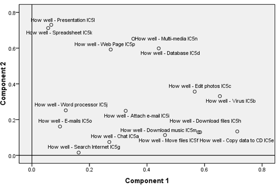
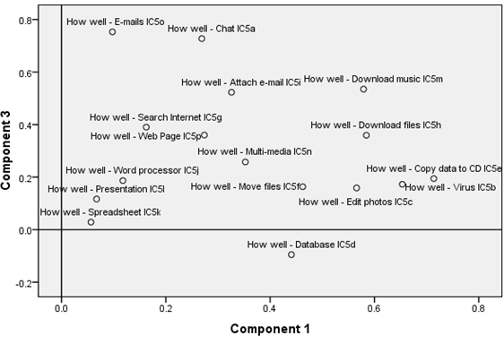
The following table shows how each variable correlates with the four extracted factors.
| Rotated Component Matrix | ||||
| Component | ||||
| 1 | 2 | 3 | 4 | |
| IC05Q01 How well - Chat IC5a | .269 | .075 | .727 | .231 |
| IC05Q02 How well - Virus IC5b | .653 | .331 | .173 | .063 |
| IC05Q03 How well - Edit photos IC5c | .566 | .357 | .159 | .287 |
| IC05Q04 How well - Database IC5d | .441 | .599 | -.095 | .027 |
| IC05Q05 How well - Copy data to CD IC5e | .714 | .134 | .194 | .297 |
| IC05Q06 How well - Move files IC5f | .463 | .113 | .163 | .644 |
| IC05Q07 How well - Search Internet IC5g | .162 | .015 | .390 | .664 |
| IC05Q08 How well - Download files IC5h | .584 | .130 | .359 | .304 |
| IC05Q09 How well - Attach e-mail IC5i | .326 | .249 | .523 | .381 |
| IC05Q10 How well - Word processor IC5j | .118 | .252 | .187 | .734 |
| IC05Q11 How well - Spreadsheet IC5k | .056 | .712 | .029 | .350 |
| IC05Q12 How well - Presentation IC5l | .067 | .730 | .117 | .279 |
| IC05Q13 How well - Download music IC5m | .579 | .129 | .535 | .036 |
| IC05Q14 How well - Multi-media IC5n | .352 | .652 | .258 | -.009 |
| IC05Q15 How well - E-mails IC5o | .098 | .161 | .753 | .379 |
| IC05Q16 How well - Web Page IC5p | .274 | .592 | .360 | -.131 |
| Extraction Method: Principal Component Analysis.
Rotation Method: Varimax with Kaiser Normalization. | ||||
Looking at this component matrix and component plots in the figures we now can put names on these underlying newly found variables.
- Component one could be labeled: Subjective competence in downloading
- Component two could be labeled: Subjective competence in use of production tools
- Component three could be labeled: Subjective competence in Internet use
Review question
|
Repertory grid analysis[edit | edit source]
To finish our short introduction to multivariate exploratory data analysis, let us now discuss a more qualitative approach that uses quantitative data analysis methodology. Repertory grid technique (RGT) was invented in the 1950’s by George Kelly in the framework of this Personal Construct Theory. RGT is based on the assumption that people’s view of objects with which they interact is made up of an idiographic (individual) collection of related similarity–difference dimensions, referred to as personal constructs. RGT has been used in a large variety of fundamental and applied research projects and one of its strength is that it allows the elicitation of perceptions without researcher interference or bias.
A common way to describe the RGT is as the identification of a set of elements within a topic (e.g. a set of design languages) which are then rated according to certain criteria termed constructs. Elements and constructs can be defined by the researcher, but are usually elicited from the subject by a so-called triadic method. Participants will first name a few elements with which they are familiar, e.g. names of design systems. They have to compare triads of elements, for instance design A with designs B and C, and then state in what aspect two are similar and the third is different. This procedure is repeated with other combinations of elements until no more new constructs are elicited from the user and until all elements can be discriminated in the construct’s space.
The output is a grid, which records a subject's ratings, usually on a 5- or 7-point scale, of m elements in terms of n constructs. This resulting grid can then be analyzed with various data analysis techniques, such as visual inspection, factor and cluster analysis.
Links and references[edit | edit source]
On lines resources[edit | edit source]
- Online pages
- Exploratory data analysis (Wikipedia)
- Statistics Hell. Dr. Andy Field's slides and handouts (with some dripping blood). Some of his stuff is really recommended, in particular the introductory texts on factor and cluster analysis.http://www.statisticshell.com/
- Online handbooks
- NIST/SEMATECH e-Handbook of Statistical Methods Exploratory Data Analysis, retrieved 18:35, 5 March 2009 (UTC)
References[edit | edit source]
- Class, Barbara (2009), Study of a blended socio-constructivist conference interpreters trainers training course empowered by an activity based, collaborative learning environment, PhD Thesis (draft). TECFA, University of Geneva, 2009.
- Tukey, John Wilder (1977). Exploratory Data Analysis. Addison-Wesley. ISBN 0-201-07616-0
Data[edit | edit source]
To do[edit | edit source]
- Data visualization
 KSF
KSF