Methodology tutorial - quantitative data analysis
 From EduTechWiki - Reading time: 10 min
This is part of the methodology tutorial (see its table of contents).
Introduction[edit | edit source]
This tutorial is a short introduction to simple (rather confirmatory) statistics for beginners.
- Learning goals
- Understand the importance of data assumptions, e.g. understand the bad influence of "extreme cases"
- Understand the "find structure" principle of statistical data analysis
- Be able to identify the major stages of (simple) statistical analysis
- Know the difference between the four kinds of statistical coefficients
- Be able to select a procedure for bi-variate analysis according to data types
- Understand crosstabulation
- Understand analysis of variance
- Understand simple regression analysis
- Prerequisites
- Methodology tutorial - empirical research principles
- Methodology tutorial - theory-driven research designs
- Methodology tutorial - descriptive statistics and scales
- Moving on
- Level and target population
- Beginners
- Quality
- to be improved, but usable
Scales and "data assumptions"[edit | edit source]
Types of quantitative measures (scales)[edit | edit source]
Quantitative data come in different types or forms as we have seen in descriptive statistics and scales tutorial.
Let's recall the three data types:
- nominal, i.e. categorized observations (e.g. country names)
- ordinal, i.e. rankings
- interval, i.e. quantitative scaled observations (e.g. a score)
For each type of measure or combinations of types of measures, you will have to use particular analysis techniques. In other words, most statistical procedures only work with certain kinds of data types.
There is a bigger choice of statistical techniques for quantitative (interval) variables. Therefore scales like (1) strongly agree, (2) agree, (3) somewhat agree, etc. usually are treated as interval variables, although it's not totally correct to do so.
Data types are not the only technical constraints for the selection of a statistical procedure, sample size and data assumptions are others.
Data assumptions[edit | edit source]
In addition to their data types, many statistical analysis types only work for given sets of data distributions and relations between variables.
In practical terms this means that not only you have to adapt your analysis techniques to types of measures but you also (roughly) should respect other data assumptions.
- Linearity
The most frequent assumption about relations between variables is that the relationships are linear.
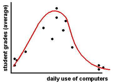
In the following example the relationship is non-linear: students that show weak daily computer use have bad grades, but so do they ones that show very strong use.
Popular measures like the Pearson’s r correlation will "not work", i.e. you will have a very weak correlation and therefore miss this non-linear relationship.
- Normal distribution
Most methods for interval data also require a so-called normal distribution (see the Methodology tutorial - descriptive statistics and scales)
If you have data with "extreme cases" and/or data that is skewed (assymetrical), some individuals will have much more "weight" than the others.
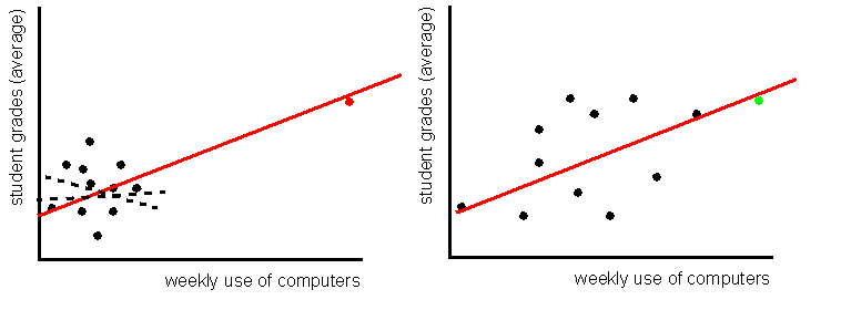
Hypothetical example:
- The "red" student who uses the computer for very long hours will lead to a positive correlation and positive regression rate, whereas the "black" ones alone in the data suggest an inexistent correlation. Mean use of computers does not represent "typical" usage in this case, since the "red" one "pulls the mean upwards".
- The "green" student however, will not have a major impact on the result, since the other data are well distributed along the 2 axis. In this second case the "mean" represents a "typical" student.
In addition you also should understand that extreme values already have more weight with variance-based analysis methods (i.e. regression analysis, Anova, factor analysis, etc.) since since distances are computed as squares.
The principle of statistical analysis[edit | edit source]
Finding structure[edit | edit source]
The goal of statistical analysis is quite simple: find structure in the data. We can express this principle with two synonymous formulas:
DATA = STRUCTURE + NON-STRUCTURE
DATA = EXPLAINED VARIANCE + NOT EXPLAINED VARIANCE
Example: Simple regression analysis
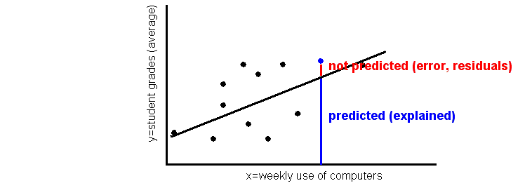
- DATA = predicted regression line + residuals (unexplained noise)
In other words: regression analysis tries to find a line that will maximize prediction and minimize residuals.
Stages of statistical analysis[edit | edit source]
Let's have look of what we mean be statistical analysis and what your typically have to do. We shall come back to most stages throughout this tutorial page:
- Clean your data
- Make very sure that your data are correct (e.g. check data transcription)
- Make very sure that missing values (e.g. not answered questions in a survey) are clearly identified as missing data
- Gain knowledge about your data
- Make lists of data (for small data sets only !)
- Produce descriptive statistics, e.g. means, standard-deviations, minima, maxima for each variable
- Produce graphics, e.g. histograms or box plot that show the distribution
- Produce composed scales
- E.g. create a single variable from a set of questions
- Make graphics or tables that show relationships
- E.g. Scatter plots for interval data (as in our previous examples) or cross-tabulations
- Calculate coefficients that measure the strength and the structure of a relation
- Strength examples: Cramer’s V for cross-tabulations, or Pearson’s R for interval data
- Structure examples: regression coefficient, tables of means in analysis of variance
- Calculate coefficients that describe the percentage of variance explained
- E.g. R2 in a regression analysis
- Compute significance level, i.e. find out if you have to right to interpret the relation
- E.g. Chi-2 for crosstabs, Fisher’s F in regression analysis
Note: With statistical data analysis programs you easily can do several steps in one operation.
Types of statistical coefficients[edit | edit source]
All statistical analysis produce various kinds (lots) of coefficients, i.e. numbers that will summarize certain kinds of informations.
Always make sure to use only coefficients that are appropriate for your data
There are four big kinds of coefficients and you find these in most analysis methods:
- (1) Strength of a relation
- Coefficients usually range from -1 (total negative relationship) to +1 (total positive relationship). 0 means no relationship.
- (2) Structure (tendency) of a relation
- Summarizes a trend
- (3) Percentage of variance explained
- Tells how much structure is in your model
- (4) Signification level of your model
- Gives that chance that you are in fact gambling
- Typically in the social sciences a sig. level lower than 5% (0.05) is acceptable. Do not interpret data that is above !
These four types are mathematically connected: E.g. the signification level is not just dependent on the size of your sample, but also on the strength of a relation.
Overview of statistical methods[edit | edit source]
Statistical data analysis methods can be categorized according to data types we introduced in the beginning of this tutorial module.
The following table shows a few popular simple bi-variate analysis methods for a given independent (explaining) variable X and a dependent (to be explained) variable Y.
|
Dependant variable Y | |||
|---|---|---|---|
|
Quantitative (interval) |
Qualitative (nominal or ordinal) | ||
|
Independent (explaining) |
Quantitative |
Correlation and Regression |
Logistic regression |
|
Qualitative |
Analysis of variance |
Crosstabulations | |
Popular multi-variate analysis
|
Dependant variable Y | |||
|---|---|---|---|
|
Quantitative (interval) |
Qualitative (nominal or ordinal) | ||
|
Independent(explaining) |
Quantitative |
Factor Analysis, multiple regression, SEM, Cluster Analysis, |
Logit. Alternatively, transform X into a qualitative variable and see below or split a variable into several dichotomic (yes/no) variables and see to the left. |
|
Qualitative |
Anova |
Multidimensional scaling etc. | |
Crosstabulation[edit | edit source]
Crosstabulation is a popular technique to study relationships between normal (categorical) or ordinal variables.
The principle of cross tabulation analysis[edit | edit source]
Crosstabulation is simple, but beginner nevertheless get it often wrong. You do have to remember the basic objective of simple data analysis: Explain variable Y with variable X.
- Computing the percentages (probabilities)
Since you want to know the probability (percentage) that a value of X leads to a value of Y, you will have to compute percentages in order to able to "talk about probabilities".
In a tabulation, the X variable is usually put on top (i.e. its values show in columns) but you can do it the other way round. Just make sure that you get the percentages right !
- Steps
- Compute percentages across each item of X (i.e. "what is the probability that a value of X leads to a value of Y")
- Then compare (interpret) percentages across each item of the dependant (to be explained) variable
Let's recall the simple experimentation paradigm in which most statistical analysis is grounded since research is basically about comparison. Note: X is put to the left (not on top):
| Treatment | effect (O) | non-effect (O) | Total effect for a group |
|---|---|---|---|
| treatment: (group X) | bigger | smaller | 100 % |
| non-treatment: (group non-X) | smaller | bigger | 100 % |
You have to interpret this table in the following way: The chance that a treatment (X) leads to a given effect (Y) is higher than the chance that a non-treatment will have this effect.
Anyhow, a "real" statistical crosstabulation example will be presented below. Let's first discuss a few coefficients that can summarize some important information.
- Statistical association coefficients (there are many!)
- Phi is a chi-square based measure of association and is usually used for 2x2 tables
- The Contingency Coefficient (Pearson's C). The contingency coefficient is an adjustment to phi, intended to adapt it to tables larger than 2-by-2.
- Somers' d is a popular coefficient for ordinal measures (both X and Y). There exist two variants: "Symmetric" and "Y dependant on X".
- Statistical significance tests
Pearson's chi-square is by far the most common. If simply "chi-square" is mentioned, it is probably Pearson's chi-square. This statistic is used to text the hypothesis of no association of columns and rows in tabular data. It can be used with nominal data.
- In SPSS
- You fill find crosstabs under menu: Analyze->Descriptive statistics->Crosstabs
- You then can must select percentages in "Cells" and coefficients in "statistics". This will make it "inferential", not just "descriptive".
Crosstabulation - Example 1[edit | edit source]
We want to know if ICT training will explain use of presentation software in the classroom.
There are two survey questions:
- Did you receive some formal ICT training ?
- Do you use a computer to prepare slides for classroom presentations ?
Now let's examine the results
| X= Did you receive some formal ICT training ? | Total | ||||
| No | Yes | ||||
| Y= Do you you use a computer to prepare slides for classroom presentations ? |
Regularly | Count | 4 | 45 | 49 |
| % within X | 44.4% | 58.4% | 57.0% | ||
|---|---|---|---|---|---|
| Occasionally | Count | 4 | 21 | 25 | |
| % within X | 44.4% | 27.3% | 29.1% | ||
| 2 Never | Count | 1 | 11 | 12 | |
| % within X | 11.1% | 14.3% | 14.0% | ||
| Total | Count | 9 | 77 | 86 | |
| % within X | 100.0% | 100.0% | 100.0% | ||
The probability that computer training ("Yes") leads to superior usage of the computer to prepare documents is very weak (you can see this by comparing the % line by line.
The statistics tell the same story:
- Pearson Chi-Square = 1.15 with a signification= .562
- This means that the likelihood of results being random is > 50% and you have to reject relationship
- Contingency coefficient = 0.115, significance = .562. (same result)
Therefore: Not only is the relationship very weak, but it can not be interpreted. In other words: There is absolutely no way to assert that ICT training leads to more frequent use of presentation software in our case.
Crosstabulation - Example 2[edit | edit source]
We want to know if the teacher's belief that students will gain autonomy when using Internet resource will have an influence on classroom practice, i.e. organize activities where learners have to search information on the Internet.
(translation needed)
- X = Teachers belief: Leaners will gain autonomy through using Internet resources
- Y = Classroom activities: Search information on the Internet
| X= Leaners will gain autonomy through using Internet resources (teacher belief) | |||||||
| 0 Fully disagree | 1 Rather disagree | 2 Rather agree | 3 Fully agree | Total | |||
| Y= Search information on the Internet |
0 Regularly | Count | 0 | 2 | 9 | 11 | 22 |
| % within X | .0% | 18.2% | 19.6% | 42.3% | 25.6% | ||
|---|---|---|---|---|---|---|---|
| 1 Occasionnally | Count | 1 | 7 | 23 | 11 | 42 | |
| % within X | 33.3% | 63.6% | 50.0% | 42.3% | 48.8% | ||
| 2 Never | Count | 2 | 2 | 14 | 4 | 22 | |
| % within X | 66.7% | 18.2% | 30.4% | 15.4% | 25.6% | ||
| Total | Count | 3 | 11 | 46 | 26 | 86 | |
| % within X | 100.0% | 100.0% | 100.0% | 100.0% | 100.0% | ||
- We have a weak significant relationship: the more teachers agree that students will increase learning autonomy from using Internet resources, the more is it likely that they will let students do so.
The statistical coefficients we use is "Directional Ordinal by Ordinal Measures with Somer’s D":
| Values | Somer’s D | Significance |
|---|---|---|
| Symmetric | -.210 | .025 |
| Y = Search information on the Internet - Dependent | -.215 | .025 |
Therefore, teacher's belief explain things, but the relationship is very weak ....
Simple analysis of variance[edit | edit source]
Analysis of variance (and it’s multi-variate variant Anova) are the favorite tools of the experimentalists. It is also popular in quasi-experimental research and survey research as the following example shows.
The principle of analysis of variance[edit | edit source]
X is an experimental condition (therefore a nominal variable) and Y usually is an interval variable.
Example: Does presence or absence of ICT usage influence grades ?
- You can show that X has an influence on Y if means achieved by different groups (e.g. ICT vs. non-ICT users) are significantly different.
Significance improves when:
- Means of the X groups are different (the further apart the better)
- Variance inside X groups is low (certainly lower than the overall variance)
- Coefficients
- Standard deviation is a measure of variance. It means "the mean deviation from the mean". I.e. how far from the central point is the "typical" individual.
- Eta is a correlation coefficient
- Eta square measures the explained variance
- In SPSS
Analysis of variance can be found in two different locations:
- Analyze->Compare Means
- General linear models (avoid this is you are a beginner)
Differences between teachers and teacher students[edit | edit source]
In this example we want to know if teacher trainees (e.g. primary teacher students) are different from "real" teachers regarding three kinds of variables:
- Frequency of different kinds of learner activities
- Frequency of exploratory activities outside the classroom
- Frequency of individual student work
COP1, COP2, COP3 are indices (composite variables) that range from 0 (little) to 2 (a lot)
Therefore we compare the average (mean) of the populations for each variable.
| Population | COP1 Frequency of different kinds of learner activities | COP2 Frequency of exploratory activities outside the classroom | COP3 Frequency of individual student work | |
|---|---|---|---|---|
| 1 Teacher trainee | Mean | 1.528 | 1.042 | .885 |
| N | 48 | 48 | 48 | |
| Std. Deviation | .6258 | .6260 | .5765 | |
| 2 Regular teacher | Mean | 1.816 | 1.224 | 1.224 |
| N | 38 | 38 | 38 | |
| Std. Deviation | .3440 | .4302 | .5893 | |
| Total | Mean | 1.655 | 1.122 | 1.035 |
| N | 86 | 86 | 86 | |
| Std. Deviation | .5374 | .5527 | .6029 |
Standard deviations within groups are rather high (in particular for students), which is a bad thing: it means that among students they are highly different.
Anova Table and measures of associations[edit | edit source]
At this stage, all you will have to do is look at the sig. level which should be below 0.5. You only accept 4.99% chance that the relationship is random.
| Variables (Y) explained by population (X) | Sum of Squares | df | Mean Square | F | Sig. | |
|---|---|---|---|---|---|---|
| COP1 Frequency of different kinds of learner activities * Population |
Between Groups | 1.759 | 1 | 1.759 | 6.486 | .013 |
| Within Groups | 22.785 | 84 | .271 | |||
| Total | 24.544 | 85 | ||||
| COP2 Frequency of exploratory activities outside the classroom * Population |
Between Groups | .703 | 1 | .703 | 2.336 | .130 |
| Within Groups | 25.265 | 84 | .301 | |||
| Total | 25.968 | 85 | ||||
| COP3 Frequency of individual student work * Population |
Between Groups | 2.427 | 1 | 2.427 | 7.161 | .009 |
| Within Groups | 28.468 | 84 | 339 | |||
| Total | 30.895 | 85 |
Measures of Association
|
Eta |
Eta Squared | |
|---|---|---|
|
Var_COP1 Frequency of different kinds of learner activities * Population |
.268 |
.072 |
|
Var_COP2 Frequency of exploratory activities outside the classroom * Population |
.164 |
.027 |
|
Var_COP3 Frequency of individual student work * Population |
.280 |
.079 |
Result: Associations are week and explained variance very weak. The "COP2" relation is not significant.
Regression Analysis and Pearson Correlations[edit | edit source]
We already introduced the principle of linear regression above. It is use to compute a trend between an explaining variable X and explained variable Y. Both must be quantitative variables.
The principle of regression analysis[edit | edit source]
Let's recall the principle: Regression analysis tries to find a line that will maximize prediction and minimize residuals.
- DATA = predicted regression line + residuals (unexplained noise)
- Regression coefficients
We have two parameters that summarize the model:
- B = the slope of the line
- A (constant) = offset from 0
The Pearson correlation (r) summarizes the strength of the relation
R square represents the variance explained.
Linear bi-variate regression example[edit | edit source]
The question: Does teacher age explain exploratory activities outside the classroom ?
- Independent variable X: Age of the teacher
- Dependent variable Y: Frequency of exploratory activities organized in the classroom
- Regression Model Summary
| R | R Square | Adjusted R Square | Std. Error of the Estimate | Pearson Correlation | Sig. (1-tailed) | N |
|---|---|---|---|---|---|---|
| .316 | .100 | .075 | .4138 | .316 | .027 | 38 |
- Model Coefficients
| Coefficients | Stand. coeff. | t | Sig. | Correlations | ||
|---|---|---|---|---|---|---|
| B | Std. Error | Beta | Zero-order | |||
| (Constant) | .706 | .268 | 2.639 | .012 | ||
| AGE Age | .013 | .006 | .316 | 1.999 | .053 | .316 |
| Dependent Variable: Var_COP2 Fréquence des activités d'exploration à l'extérieur de la classe | ||||||
All this means:
- We have a week relation (.316) between age and exploratory activities. It is significant (.027)
Formally speaking, the relation is:
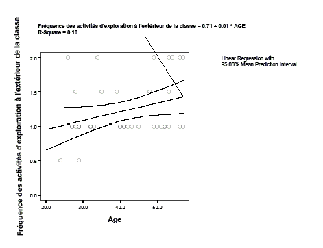
exploration scale = .705 + 0.013 * AGE
It also can be interpreted as: "only people over 99 are predicted a top score of 2" :)
Here is a scatter plot of this relation:
There is no need for statistical coefficients to see that the relation is rather week and why the prediction states that it takes a 100 years to get there... :)
Links[edit | edit source]
- Online handbooks
There are excellent statistics resources on the web. For starters we recommend:
- StatSoft Electronic Statistics Textbook. Very good and fairly suitable for beginners, from StatSoft the makers of Statistica.
- PA 765 Statnotes: An Online Textbook by G. David Garson, NC State University. Very good Hypertext with many detailed "chapters", not always suitable for total beginners. Also makes references to SPSS procedures . In this tutorial, we referred to several pages.
- Online pages
- Normalization_(statistics) (Wikipedia)
- Standard score (Wikipedia)
- Skewness (Wikipedia)
- More
See Research methodology resources for more pointers.
To do[edit | edit source]
- Translate examples
- Review everything and add some more explanations
- Add logistic regression ?
 KSF
KSF


