Television news screen layout
Topic: Engineering
 From HandWiki - Reading time: 6 min
This article possibly contains original research. (August 2025) (Learn how and when to remove this template message) |

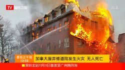
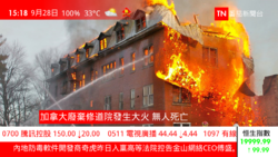
A television news screen layout or television news screen interface refers to the layout image displayed during a television news program broadcast. The layouts used differ between television stations and countries, and information displayed may include things such as main news topics and headlines within the lower third, channel logos, a news ticker, a time clock, and in some cases weather and information in the economic and financial fields.
Different layouts may be used within news broadcasting to achieve varying effects, and designs are often formulated by broadcast designers with the intention of being informative and visually appealing. The main purpose of television news screen layouts is to present to viewers a concentrated level of information within the shortest amount of time possible, whilst maintaining a reasonably adequate balance so that excessive detail does not confuse the viewer.[1]
Screen interface composition
Malaysia
In Malaysia, Malaysian Mandarin television news programs tend to veer towards simpler and concise designs. Television channels of differing geographical regions and channel topics vary in their general appearance. The free-to-air terrestrial channel of 8TV since a major redesign on 8 April 2022 with relatively different news screen interfaces with 8TV having a much more complex layout containing a double news ticker for news information.
Mainland China

Within mainland China, news programs tend to veer towards simpler and concise designs. Television channels of differing geographical regions and channel topics vary in their general appearance. The news channel of China Central Television, CCTV-13, has adopted a design more similar to that of Taiwanese television channels since a major redesign in 2009.[2] Not long after the redesign of CCTV-13, regional channels such as Dragon Television and Hunan Television adapted a Taiwanese-influenced interface design based similarly on that of CCTV-13. The CCTV international (CCTV-4) and finance (CCTV-2) channels adopted relatively different news screen interfaces, with CCTV-2 having a much more complex layout containing a double news ticker similar to that of CNBC for news and stock market information.
Hong Kong

Most news broadcasts in Hong Kong focus on simplicity and minimalism, and generally do not include superfluous information at inessential times. Some channels, however, opt towards a more complex style, especially channels specifically dealing with finance and economics.
Taiwan

News broadcast layout designs in Taiwan are similar to the designs used in the United States, however, use colour and position to maintain a layout's main entity. Each television station has a different layout pattern, although the general structure does not significantly differ. Commonly used layout components include news tickers that may run horizontally or vertically containing different information (per government regulations, vertical tickers may only display important warnings from the National Communications Commission, such as typhoon and earthquake information, and important civil announcements), a time clock, and a box containing meteorological data from the Central Weather Bureau.
News channels covering finance and economics display financial data during the opening hours of the Taiwan Stock Exchange, where the main screen layout will shrink to one-quarter of the screen, leaving the remainder for live financial information such as market and stock price indices of each listed share in succession.
Japan


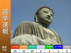
Television channels in Japan generally have very little layout structure at all, and merely on occasion display news headlines and summary text, in addition to the station logo and time clock. In most cases, only the reporter's name, event location and a short basic summary is displayed. These simple layout structures were initially used around the world during the late 1980s and early 1990s, due to the processing power of the computers then used for signatures. During election periods, major sporting competitions and natural disasters, news broadcasts switch to an L-shaped image layout (ja), shrinking the size of the original news display to make room for additional information relating to the election, sporting competition or natural disaster at hand.[3][4]
See also
References
- ↑ Rodrigues, R., (2012). A Television News Graphical Layout Analysis Method Using Eye Tracking. International Conference on Information Visualisation, 16, pp.357–362. doi:10.1109/IV.2012.66
- ↑ 李斌, 2009-07-27, 央视《朝闻天下》改版 观众称“感觉像是CNN”, 法制晚报
- ↑ 参考資料 – 総務省, Ministry of Internal Affairs and Communications (Japan)
- ↑ NHKは何を伝えてきたか-NHKテレビ番組の50年, NHK. Quote: "何かが起これば、頼りになるのがテレビだ。1997年の秋、NHKは台風が本土を直撃しようとした時、あえてテレビ画面の隅を使って、逆L字型画面で台風情報を繰り返し放送した。緊急の情報を放送するには、このマルチ画面は非常に有効だった。これは結果として、データ放送の価値とその利用方法を周知させる結果となった。" (If something occurs, the television is reliable. In the Fall of 1997, as a typhoon headed towards the mainland, NHK repeatedly broadcast typhoon information in the corner of the TV screen within a reversed L-shape. This display was very effective. As a result, this demonstrated the value of the utilisation of data broadcasting to the masses.)
 |
 KSF
KSF