Information design
 From HandWiki - Reading time: 10 min
| Part of a series on Statistics |
| Data visualization |
|---|
Information design is the practice of presenting information in a way that fosters an efficient and effective understanding of the information. The term has come to be used for a specific area of graphic design related to displaying information effectively, rather than just attractively or for artistic expression. Information design is closely related to the field of data visualization and is often taught as part of graphic design courses.[1] The broad applications of information design along with its close connections to other fields of design and communication practices have created some overlap in the definitions of communication design, data visualization, and information architecture.
According to Per Mollerup, information design is explanation design. It explains facts of the universe and leads to knowledge and informed action.[2]
History
The term 'information design' emerged as a multidisciplinary area of study in the 1970s. Use of the term is said to have started with graphic designers and it was solidified with the publication of the Information Design Journal in 1979. Later, the related International Institute for Information Design (IIID) was set up in 1987 and Information Design Association (IDA) established in 1991.[3] In 1982, Edward Tufte produced a book on information design called The Visual Display of Quantitative Information. The term information graphics tends to be used by those primarily concerned with diagramming and display of quantitative information, such as technical communicators and graphic designers.
In technical communication, information design refers to creating an information structure for a set of information aimed at specified audiences. It can be practised on different scales.
- On a large scale, it implies choosing relevant content and dividing it into separate manuals by audience and purpose.
- On a medium scale, it means organizing the content in each manual and making sure that overviews, concepts, examples, references, and definitions are included and that topics follow an organizing principle.
- On a small or detailed scale, it includes logical development of topics, emphasis on what's important, clear writing, navigational clues, and even page design, choice of font, and use of white space.
There are many similarities between information design and information architecture. The title of information designer is sometimes used by graphic designers who specialize in creating websites. The skillset of the information designer, as the title is applied more globally, is closer to that of the information architect in the U.S. Similar skills for organization and structure are brought to bear in designing web sites and digital media, with additional constraints and functions that earn a designer the title information architect.
In computer science and information technology, 'information design' is sometimes a rough synonym for (but is not necessarily the same discipline as) information architecture, the design of information systems, databases, or data structures. This sense includes data modeling and process analysis.
Early examples

Information design is associated with the age of technology but it does have historical roots. Early instances of modern information design include these effective examples:
- William Playfair's line, bar, pie, and area charts illustrating England's trade (1786 and 1801)[4][5]
- John Snow's spot maps, which pinpointed the source of a deadly cholera outbreak in 1850s London[6]
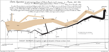
- Charles Joseph Minard's 1861 diagram depicting Napoleon's Russian campaign of 1812[7]
- W.E.B. Du Bois's data visualization on the lives of Black Americans for the 1900 World's Fair[8]
- Otto Neurath's International Picture Language of the 1930s[9]
- Florence Nightingale's information graphic depicting army mortality rates[10]
The Minard diagram shows the losses suffered by Napoleon's army in the 1812–1813 period. Six variables are plotted: the size of the army, its location on a two-dimensional surface (x and y), time, direction of movement, and temperature. This multivariate display on a two-dimensional surface tells a story that can be grasped immediately while identifying the source data to build credibility. Edward Tufte wrote in 1983 that: "It may well be the best statistical graphic ever drawn."[5]
Applications


Information design can be used for broad audiences (such as signs in airports) or specific audiences (such as personalized telephone bills).[11] The resulting work often seeks to improve a user's trust of a product (such as medicine packaging inserts, operational instructions for industrial machinery and information for emergencies). The example of signs also highlights a niche category known as wayfinding.
Governments and regulatory authorities have legislated about a number of information design issues, such as the minimum size of type in financial small print, the labelling of ingredients in processed food, and the testing of medicine labelling. Examples of this are the Truth in Lending Act in the USA, which introduced the Schumer box (a concise summary of charges for people applying for a credit card), and the Guideline on the Readability of the Labelling and Package Leaflet of Medicinal Products for Human Use (European Commission, Revision 1, 12 January 2009).
Professor Edward Tufte explained that users of information displays are executing particular analytical tasks such as making comparisons or determining causality. The design principle of the information graphic should support the analytical task, showing the comparison or causality.[12]
Simplicity
Simplicity is a major concern in information design. The aim is clarity and understanding. Simplification of messages may imply quantitative reduction but is not restricted to that. Sometimes more information means more clarity. Also, simplicity is a highly subjective matter and should always be evaluated with the information user in mind. Simplicity can be easy when following five simple steps when it comes to information design:
- Tell the truth,
- Get to the point,
- Pick the right tool for the job,
- Highlight what is important,
- Of course, keep it simple.
These steps will help an information designer narrow down results, as well as keeping their audience engaged.[13]
See also
- Cartography
- Chief experience officer (CXO)
- Content management
- Epidemiology
- Knowledge visualization
- Plain language
- Signage
- Statistics
- Succinctness
- Technical communication
- Technical illustration
- Typography
- Visual literacy
- Wayfinding
- Web indexing
References
- ↑ "Graphic Design | Graphic Design Degree | BA & MA Degree Programs | CCSU". http://www.design.ccsu.edu/.
- ↑ Per Mollerup, Data Design: Visualising quantities, locations, connections, Bloomsbury Academic, 2015
- ↑ "The Origins of the Information Design Association". University of Reading. 2008. http://www.robwaller.org/IDA_origins_RW.pdf.
- ↑ "First Ever Area Charts Created 200+ Years Ago". AnyChart. 23 December 2015. http://www.anychart.com/blog/2015/12/23/first-area-charts-history/.
- ↑ 5.0 5.1 Tufte, Edward (1983). The Visual Display of Quantitative Information. Cheshire, Connecticut: Graphics Press. ISBN 0961392142. https://archive.org/details/visualdisplayofq0000tuft.
- ↑ Crosier, Scott. "John Snow: The London Cholera Epidemic of 1854". University of California, Santa Barbara. http://webprojects.oit.ncsu.edu/project/bio183de/Black/science/science_reading/8.html.
- ↑ Corbett, John. "Charles Joseph Minard: Mapping Napoleon's March, 1861". Center for Spatially Integrated Social Science. http://www.csiss.org/classics/content/58.
- ↑ Mansky, Jackie (15 November 2018). "W.E.B. Du Bois' Visionary Infographics Come Together for the First Time in Full Color". Smithsonian Magazine. https://www.smithsonianmag.com/history/first-time-together-and-color-book-displays-web-du-bois-visionary-infographics-180970826/.
- ↑ Popova, Maria (8 March 2011). "The Invention of ISOTYPE: How a Vintage Visual Language Paved the Way for the Infographics Age". Brain Pickings. https://www.brainpickings.org/2011/03/08/the-transformer-isotype/.
- ↑ Small, Hugh. "Florence Nightingale's statistical diagrams". http://www.florence-nightingale-avenging-angel.co.uk/GraphicsPaper/Graphics.htm.
- ↑ "Information Design FAQ". http://www.bogieland.com/infodesign_faq.htm.
- ↑ Edward Tufte-Presentation-August 2013
- ↑ Duarte, Nancy. Slide:ology: The Art and Science of Creating Great Presentations. Beijing: O'Reilly Media, 2008. Print.
External links
- InformationDesign.org
- International Institute for Information Design
- Communication Research Institute: Defining information design
- Information Design Journal
- UK Information Design Association
- Society for Technical Communication Information Design – Information Architecture (ID–IA) Special Interest Group (SIG)
- Visualizing Information for Advocacy: An Introduction to Information Design Booklet on information design for non-profit and non-governmental organizations.
- McCandless, David (2010). "The beauty of data visualization". http://www.ted.com/talks/david_mccandless_the_beauty_of_data_visualization.html.
- https://ahmedabadwebsitedesign.com
it:infografica
 |
 KSF
KSF
