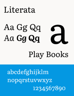
Literata
 From HandWiki - Reading time: 4 min
 | |
| Category | Serif |
|---|---|
| Classification | Old-style |
| Designer(s) | Veronika Burian and José Scaglione (Latin), Vera Evstafieva and Kiril Zlatkov (Cyrillic), Irene Vlachou and Gerry Leonidas (Greek) |
| Commissioned by | |
| Foundry | TypeTogether |
| Date released | 2015 |
| Characters | 1,100+ |
| License | SIL Open Font License (since 2.1) |
| Website | www |
Literata is an old-style serif typeface commissioned by Google and designed by the independent type foundry TypeTogether. It was released in 2015 and is the default font family in Google Play Books, since version 3.4.5. The typeface was intended to establish a unique visual identity for the Play Books app, suitable across a wide variety of screen sizes, resolutions, and rendering software. The designers went back to the old-style Roman and Scotch typefaces for inspiration.[1][2]
Literata initially included two different weights (regular and bold) and corresponding upright italicised variations (no real italic). Version 2.1 named Literata Book added two different weights (Medium and SemiBold) and small caps, and made cap-height numerals the default.[3]
It includes support for full extended Latin, Polytonic Greek, and Cyrillic scripts. Compared to Play Books' former default font Droid Serif, Literata has a lower x-height and higher ascenders.[4]
On 7 December 2018, Literata was open-sourced under the SIL Open Font License and released on GitHub including the variable font version.[5]
See also
- Bookerly
References
- ↑ Weiner, Sophie (21 May 2015). "How Google Designed An E-Book Font For Any Screen". Fast Company. https://www.fastcompany.com/3046511/how-google-made-an-e-book-font-designed-for-any-screen.
- ↑ "TypeTogether - Process and Development of Literata". TypeTogether. https://github.com/googlefonts/literata/blob/master/Documentation/v2/specimen_material/Process%20and%20development%20of%20Literata.pdf.
- ↑ "Literata Book". TypeTogether. 13 June 2022. https://github.com/googlefonts/literata/tree/master/Documentation/v2/deliverables/LiterataBook.pdf.
- ↑ Tom Maxwell (2015-05-18). "Google officially introduces Literata, the new default font for Play Books". https://9to5google.com/2015/05/18/google-play-books-default-font-replace-droid-serif/.
- ↑ "googlefonts/literata". GitHub. https://github.com/googlefonts/literata.
External links
 |
 KSF
KSF