The Chartered Institute of Marketing
Topic: Organization
 From HandWiki - Reading time: 5 min
 CIM's logo | |
| Abbreviation | CIM |
|---|---|
| Predecessor | Institute of Marketing |
| Formation | 16 May 1911 |
| Legal status | Chartered |
| Headquarters | Berkshire, United Kingdom |
Chair | Kate Hamilton |
CEO | Chris Daly |
| Website | www |
The Chartered Institute of Marketing (CIM) was founded in 1911. It has over 30,000 members, including more than 3,000 registered Chartered Marketers.[1] CIM offers 130 study centres in 36 countries, and exam centres in 132 countries.[2]
In 1952 Prince Philip, Duke of Edinburgh, became the institute's patron,[3] taking over from King George VI who was appointed in 1937 as CIM's first royal patron. In 2019 King Charles III (then Prince of Wales), became the new patron of CIM.[4]
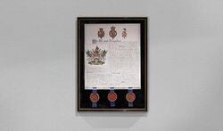
The first Code of Practice was introduced in 1973,[5] and in 1989, the institute was awarded a royal charter.[6]
CIM offers training courses,[7] and professional qualifications,[8] from foundation to postgraduate or master's degree level (EQF Level 7). In 1992, the European Union declared CIM's flagship qualification as the "preferred professional marketing qualification through member states".[9]
Membership
The two types of membership offered by CIM consist of the following grades:[10]
Introductory Membership:
- Affiliate Studying
- Affiliate Professional
Graded Membership:
- Associate – designated by the letters ACIM
- Member – designated by the letters MCIM
- Fellow – designated by the letters FCIM
Chartered Status
The Chartered Marketer status is awarded to candidates who satisfy a set of criteria that includes qualifications, proven experience, and a commitment to Continuing Professional Development (CPD).[11]
To retain the designation of a chartered professional, all registered chartered marketers are required to submit their yearly CPD records which the institute then reviews to verify their relevance and completion.[12] Candidates who fail the audit have their Chartered Marketer status revoked.[13]
Crest
Introduced in the 1960s to capture the institute's history,[14] the CIM crest was originally launched with the motto, "Bold in Selling Honest in Telling". Following a request for change, in 1975 the College of Arms authorised the present motto, "The World is our Market".[15]
In 1976, the institute, then formally known as the Institute of Marketing,[16] described the design of its crest as follows:[17]
"Many people have admired the Institute of Marketing crest, but few have any idea that its design was inspired by Lord Mancroft, President of the Institute from 1961-1962. Even fewer people know the explanation of the armorial bearings. The scales indicate fair trading, the bezants on the chevron show money passing on a green cloth. All goods are transported by sea (the Galley), land (Horseshoes), or air (Wings), and food (represented by the Grabs) must be a main feature of all markets. The crest is a hand ‘advancing the standard of trade and commerce’. The standard is green and gold for the same reason as the chevron; and finally, the two rods of mercury symbolise trade and commerce. The supporting dragons represent the customer or consumer. They are winged with the same bezants wreaths of laurel round their necks to show that the customer likes, and is worthy of, the best. The dragons are white because the customer is blameless and always right. At the same time the golden clause and spikes indicate that customers know how to protect themselves" (p.147).
The CIM crest forms an important part of the institute's heritage as it features in both the old and new logos. In the new CIM logo, the crest was given more prominence as it was placed alongside the CIM acronym whereas in the old logo, due to its relatively small proportions, many typically referred to the crest as "the dot above the i".[18]
Rebrand
Following a 12-month extensive research and consultation process, CIM appointed the international brand strategy agency, Brash, to handle its creative brief.[19][20] After the agency carried out further analysis, the institute launched its new brand identity in 2014,[21] with “royal blue” as its lead colour to recognise “the value of Britishness in the global market”.[22]
Described as “CIM’s biggest strategic and creative brand change in more than a quarter of a century”, the radical departure from the old look and feel of the brand came after the research exercise uncovered a number of inherent weaknesses in the old logo, including its incompatibility in the new digital landscape, a wordmark that was far from optimal, and a “barely decipherable" crest.[23]
The objective of CIM's rebrand was comprehensive as it also included a change in the institute's direction. As reported in Marketing Week, "The logo change...is just one element of CIM’s relaunch. Following a year-long consultation during which thousands of members and marketers were canvassed on what they wanted from CIM, the body has set itself the long-term aim of becoming a catalyst for debate and conduit for lifting the profession’s standing".[24] This sentiment was later reflected in the Trustees' Report of 2015, with the chairman of the Board of Trustees declaring that, "The launch of CIM’s new brand positioning and identity during the year received positive feedback across both the marketing and design community. The introduction of our new corporate identity was fully rolled out during the financial year, resulting in a coherent and distinct visual presence for the first time in many years. Our teams have now turned their attention to pushing the creative boundaries of our new identity and working with our channels and volunteer groups to help develop and share creative best practices".[25]
See also
- List of international professional associations
References
- ↑ "About CIM". The Chartered Institute of Marketing. https://www.cim.co.uk/about-cim/.
- ↑ "Corporate Fact Sheet". The Chartered Institute of Marketing. https://www.cim.co.uk/media/5353/cim_factsheet.pdf.
- ↑ Wilkes, Rod (2011). "Introduction". in Kourdi, Jeremy. The Marketing Century: How Marketing Drives Business and Shapes Society. John Wiley & Sons. pp. 3–17. ISBN 978-1119974130.
- ↑ "Chartered Institute of Marketing Welcomes The Prince of Wales as Patron". The Chartered Institute of Marketing. https://www.cim.co.uk/newsroom/new-patron/.
- ↑ "Our History". The Chartered Institute of Marketing. https://www.cim.co.uk/about-cim/our-history/.
- ↑ "About CIM". The Chartered Institute of Marketing. https://www.cim.co.uk/about-cim/.
- ↑ "Training Courses". The Chartered Institute of Marketing. https://www.cim.co.uk/training/list-courses/.
- ↑ "Smart and Flexible Qualifications from CIM". The Chartered Institute of Marketing. https://www.cim.co.uk/qualifications/.
- ↑ Williams, Allan (2010). The History of UK Business and Management Education. Emerald Group Publishing. p. 5. ISBN 978-1849507806. https://books.google.com/books?id=HiJeS9TFIpYC. Retrieved 8 March 2019.
- ↑ "Join the CIM Marketing Community". The Chartered Institute of Marketing. https://www.cim.co.uk/membership/types/.
- ↑ "Chartered Marketer Status". The Chartered Institute of Marketing. https://www.cim.co.uk/membership/chartered-marketer-status/.
- ↑ Baker, Michael J. (2009). "Personal Professional Development". The Marketing Review 9 (2): 107–108. doi:10.1362/146934709X442647.
- ↑ "CIM Revokes Status of 46 Marketers". Marketing Week. October 23, 2009. https://www.marketingweek.com/2009/10/23/cim-revokes-status-of-46-marketers/.
- ↑ Brown, Thomas (October 29, 2014). "IT'S BLUE! The thinking behind CIM's new brand identity". LinkedIn. https://www.linkedin.com/pulse/20141029163429-8373746-it-s-blue-the-thinking-behind-cim-s-new-brand-identity.
- ↑ Wilkes, Roderick E.. "The Power of Communities". SlidePlayer. https://slideplayer.com/slide/7272235/.
- ↑ "Our History". The Chartered Institute of Marketing. https://www.cim.co.uk/about-cim/our-history/.
- ↑ Marketing. Institute of Marketing. 1976. p. 147. https://books.google.com/books?id=AKKyAAAAIAAJ&q=admired+the+Institute+of+Marketing+crest. Retrieved March 6, 2019.
- ↑ Brown, Thomas (October 29, 2014). "IT'S BLUE! The thinking behind CIM's new brand identity". LinkedIn. https://www.linkedin.com/pulse/20141029163429-8373746-it-s-blue-the-thinking-behind-cim-s-new-brand-identity.
- ↑ Herbison, Michelle (October 30, 2014). "Chartered Institute of Marketing rebrands with a new identity and 'hackathon' to solve marketing's problems". Marketing Magazine. https://www.marketingmag.com.au/news-c/chartered-institute-of-marketing-rebrands-with-a-new-identity-and-hackathon-to-solve-marketings-problems/.
- ↑ Clarke, Rob. "Chartered Institute of Marketing". www.robclarke.com. https://robclarke.com/work/chartered-institute-of-marketing/.
- ↑ "Our History". The Chartered Institute of Marketing. https://www.cim.co.uk/about-cim/our-history/.
- ↑ "CIM Catalyst for Change". Brash Brands. https://brash.agency/projects/cim-catalyst-for-change/.
- ↑ Brown, Thomas (October 29, 2014). "IT'S BLUE! The thinking behind CIM's new brand identity". LinkedIn. https://www.linkedin.com/pulse/20141029163429-8373746-it-s-blue-the-thinking-behind-cim-s-new-brand-identity.
- ↑ Russell, Parsons (October 27, 2014). "The Chartered Institute of Marketing relaunches with new identity and purpose". Marketing Week. https://www.marketingweek.com/2014/10/27/the-chartered-institute-of-marketing-relaunches-with-new-identity-and-purpose/.
- ↑ Report and Financial Statements For the year ended 30 June 2015. The Chartered Institute of Marketing. 2015. p. 4. https://www.cim.co.uk/media/1037/group_report_and_financial_statements_2015.pdf. Retrieved March 7, 2019.
 |
 KSF
KSF


