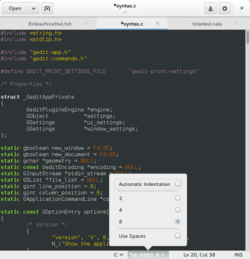
Popover (GUI)
 From HandWiki - Reading time: 3 min

A popover is a container-type graphical control element that hovers over its parent window and blocks any other interaction until it is selected. It can contain various other graphical control elements such as checkboxes, radio buttons, or list boxes. Like any container-type graphical control element, it is meant to group elements that belong together.
Popover graphical control element were introduced in GTK+ 3.12.[1]
Apple included popovers in their human interface guidelines.[2] Popovers are in use on the web. Bootstrap has a component to create popovers, similar to those found in iOS.[3]
When hovering a link in Wikipedia, by default, there is a popup of page preview that is in a way popover: it includes a button and it has more content than in tooltip.
References
- ↑ "Popovers in GTK+". 2014-01-22. https://blogs.gnome.org/mclasen/2014/01/22/and-now-popovers/.
- ↑ Popovers, developer.apple.com
- ↑ Popovers
 |
 KSF
KSF