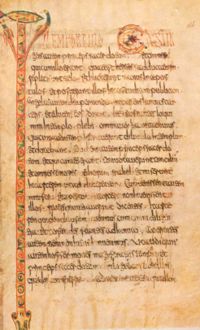
Merovingian script
 From Wikipedia - Reading time: 9 min

Merovingian script or Gallo-Roman script (Latin: Scriptura Merovingica/Francogallica) was a medieval variant of the Latin script so called because it was developed in Gaul during the Merovingian dynasty. It was used in the 7th and 8th centuries before the Carolingian dynasty and the development of Carolingian minuscule.
Script types
[edit]There were four major centres of Merovingian script: the monasteries of Luxeuil, Laon, Corbie, and Chelles. Each script developed from uncial, half-uncial, and the Merovingian charter scripts.
Luxeuil
[edit]
The Luxeuil type uses distinctive long, slim capital letters as a display script. These capitals have wedge-shaped finials, and the crossbar of ⟨a⟩ resembles a small letter ⟨v⟩ while that of ⟨h⟩ is a wavy line. The letter ⟨o⟩ is often written as a diamond shape, with a smaller ⟨o⟩ written inside. The letter ⟨a⟩ resembles two ⟨c⟩s ("cc"), and because of this distinctive feature the Luxeuil type is sometimes called "a type".[1] The letter ⟨b⟩ often has an open bowl and an arm connecting it to the following letter, the letter ⟨d⟩ can have either a vertical ascender or an ascender slanted to the left; ⟨i⟩ is often very tall, resembling l; ⟨n⟩ can be written with an uncial form (similar to a capital ⟨N⟩); ⟨o⟩ is often drop-shaped and has a line connecting it to the next letter; and ⟨t⟩ has a loop extending to the left of its top stroke. The letter ⟨t⟩ is also used in numerous ligatures where it has many other forms. The letters ⟨e⟩ and ⟨r⟩ are also quite often found in ligature.
Laon
[edit]The Laon type has thicker display capitals than the Luxeuil type. Capital initial letters are often decorated with animals, and there are many ligatures with the letter ⟨i⟩. Like Visigothic script, there are two different ⟨ti⟩ ligatures, representing two different sounds ("hard" and "soft"). The letters ⟨d⟩ and ⟨q⟩ often have open bowls. The letter a is unique, resembling two sharp points ("<<"), and the letter ⟨z⟩, uncommon in Latin, is nevertheless very distinctive in the Laon type, with a flourish projecting upwards to the left, above the line. Because of these features, Laon type is sometimes called "a-z type".
Corbie
[edit]The Corbie type as used in the 8th century, was based on uncial and the Luxeuil type, but was also similar to half-uncial and insular script, with elements of Roman cursive. It is sometimes called "eN-type", as the letter ⟨e⟩ has a high, open upper loop, and the uncial form of the letter ⟨n⟩ (resembling majuscule ⟨N⟩) is very frequently used. After the mid-8th century, the letter (a) also has an open loop and resembles the letter ⟨u⟩; this type is referred to as "eNa-type". A more distinctive type was developed at Corbie in the 9th century, the "a-b type". The letter ⟨b⟩ is similar to Luxeuil type, but the letter ⟨a⟩ has a straight first stroke, resembling a combination of ⟨i⟩ and ⟨c⟩. This type was used from the end of the 8th century until the mid-9th century. The Liber glossarum, a major medieval reference work, was written in the "a-b type" script of Corbie.
Chelles
[edit]The Chelles type was similar to the Luxeuil a-b type. Other features include the uncial ⟨N⟩, with strokes leaning to the left; the letter d with an ascender leaning to the left; the letter ⟨g⟩ with a descender resembling the letter ⟨s⟩; the letter ⟨s⟩ with a very small top loop; and the letter ⟨x⟩ with the two strokes crossing near the top of the line rather than the middle.
Development
[edit]There was also a Merovingian cursive script, used in charters and non-religious writings. All of these types were later influenced by Carolingian script, which eventually replaced it entirely. Along with resemblances to Carolingian and Visigothic, Merovingian shares some features with Beneventan script.
References
[edit]- ^ Stiennon 1991, p. 90.
Further reading
[edit]- Bischoff, Bernard (1989). Latin Palaeography: Antiquity and the Middle Ages. Cambridge University Press.
- Marcos, Juan-Jose (2024). Manual of Latin Palaeography (PDF).
- Lowe, E. A. (1972). Codices Latini Antiquiores: A Palaeographical Guide to Latin Manuscripts Prior to the Ninth Century. Oxford: Clarendon Press.
- Stiennon, Jacques (1991). Paléographie du moyen âge (2nd ed.). Paris: Armand Colin. ISBN 2-200-31278-4. OL 19938510M.
 KSF
KSF