Typography
 From Nwe
 Typography is the art and technique of arranging type, type design, and modifying type glyphs (symbolic figures). In traditional typography, text is composed to create a readable, coherent, and visually satisfying whole that does not distract from the content. The goal of good typography is to balance the relationship of letterforms on a page, in order to aid the reader in understanding the message being conveyed. Thus, typography brings harmony between the functional and aesthetic aspects of the written alphabet.
Typography is performed by a variety of professionals including typesetters, compositors, typographers, graphic artists, art directors, and comic-book artists. From its inception with the invention of printing using woodblocks and then movable type, until the Digital Age, typography was a specialized occupation. Digitization opened up typography to new generations of visual designers and lay users. Just as the invention of the printing press by Gutenberg revolutionized the world by making written material, particularly the Bible, available to the general public, so the opening of typography through digitization made the publication of material available to all and ushered in the Information Age.
Introduction
Typography from the French typographie, which derives from the Greek words τύπος typos = "dent, impression, mark, figure" and γραφία graphia = writing.
Typography seeks to balance the relationship of letterforms on a page, in order to aid the reader in understanding the form and substance. It seeks to harmonize the functional and aesthetic aspects of the written alphabet. Typography, therefore, has two tasks: It communicates both a verbal and visual message. When readers scan a typographic work, they are aware on some level of both effects—the overall graphic patterns of the page that capture the eye, and the language to be read. Effective typography establishes a proper visual hierarchy rendering the content more accessible to the reader.
- "Typography Exists to Honor Content."[1]
Each typeface, or style of print, has a unique tone that is seeks to establish harmony between the verbal and visual content of the work. Some typefaces, such as Times New Roman, have proven both more legible and convey more information through a certain density of style than others. Other typestyles have more specialized purposes, such as Italics, which is frequently used to highlight, or offset, specific information.
History
Typography has a very long history, its origins tracing back to the first punches and dies used to make seals and currency in ancient times. The basic elements of typography are at least as old as civilization and the earliest writing systems—a series of key developments that were eventually drawn together as a systematic craft. Some historians view the parallel development of techniques in China as separate from that in mid-fifteenth century Europe, while others view them as connected.
The first known movable type printing artifact is probably the Phaistos Disc, although its real purpose remains disputed. The item dates between 1850 B.C.E. and 1600 B.C.E., back to Minoan age and is now on display at the archaeological museum of Herakleion in Crete, Greece.
The Chinese invention of paper and woodblock printing produced the world's first print culture. Typography with movable type was invented in eleventh-century China. Modular movable metal type began in thirteenth-century China, and was developed again in mid-fifteenth century Europe with the development of specialized techniques for casting and combining cheap copies of letterpunches in the vast quantities required to print multiple copies of texts.
Woodblock printing
- Asia
Traditionally, there have been two main printing techniques in Asia, those of woodblock printing and movable type printing. In the woodblock technique, ink is applied to letters carved upon a wooden board, which is then pressed onto paper. With movable type, the board is assembled using different lettertypes, according to the page being printed. Wooden printing was used in the East from the eighth century onwards, and movable metal type came into use during the twelfth century.
Woodblock printing was better suited to Chinese characters than movable type, which the Chinese also invented, but which did not replace woodblock printing. In China and Korea, the use of woodblock printing on paper and movable type preceded their use in Europe by several centuries. Both methods were replaced in the second half of the nineteenth century by Western-style printing.
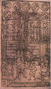
The earliest woodblock printed fragments to survive are from China and are of silk printed with flowers in three colors from the Han dynasty (before 220 C.E.). The earliest specimen of woodblock printing on paper, whereby individual sheets of paper were pressed into wooden blocks with the text and illustrations carved into them, was discovered in 1974 in an excavation of Xi'an (then called Chang'an, the capital of Tang China), Shaanxi, China. It is a dharani sutra printed on hemp paper and dated to 650 to 670 C.E., during Tang Dynasty (618–907).
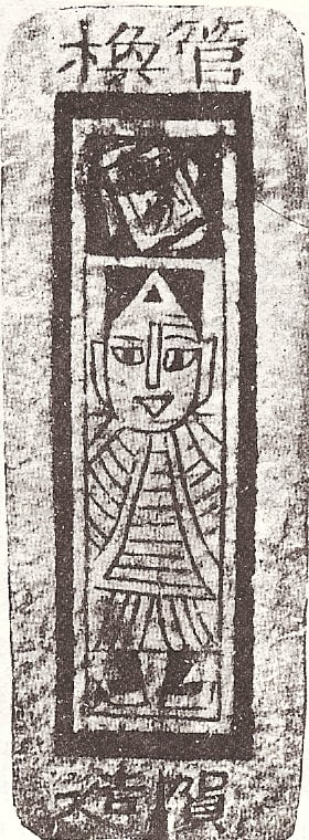
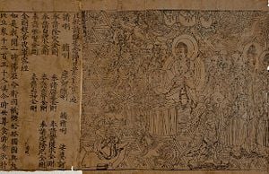
The first complete printed book was the Chinese Diamond Sutra of 868 C.E. The oldest known printed calendars in the world also came from Tang China, printed in 877 and 882.
- Europe
The earliest woodblocks used for printing in Europe, in the fourteenth century, using exactly the same technique as Chinese woodblocks, led some such as Robert Curzon (1810–1873) to hypothesize a connection:
The process of printing them must have been copied from ancient Chinese specimens, brought from that country by some early travelers, whose names have not been handed down to our times.[2]
European woodblock printing shows a clear progression from patterns to images, both printed on cloth, then to images printed on paper, when it became widely available in Europe in about 1400. Text and images printed together only appeared some 60 years later, after metal movable type was developed.
Movable type
The first known movable type system was invented in China around 1040 C.E. by Bi Sheng (990-1051). Bi Sheng's type was made of baked clay, but the fragile clay types were not practical for large-scale printing. Clay types also have the additional handicap of lacking adhesion to the ink.
Since the use of printing from movable type arose in East Asia well before it did in Europe, it is relevant to ask whether Gutenberg may have been influenced, directly or indirectly, by the Chinese or Korean discoveries of movable-type printing. Although there is no actual evidence that Gutenberg knew of the Korean processes for movable type, some have argued that movable metal type had been an active enterprise in Korea since 1234 (although the oldest preserved books are from 1377) and that there was communication between West and East.
- China
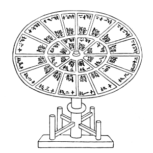
Wooden movable type was developed by the late-thirteenth century, pioneered by Wang Zhen, author of the Nong Shu (農書). Although the wooden type was more durable under the mechanical rigors of handling, repeated printing wore the character faces down, and the types could only be replaced by carving new pieces. This system was later enhanced by pressing wooden blocks into sand and casting metal types from the depression in copper, bronze, iron, or tin. The set of wafer-like metal stamp types could be assembled to form pages, inked, and page impressions taken from rubbings on cloth or paper. Before the pioneer of bronze-type printing of China, Hua Sui in 1490 C.E., Wang Zhen had experimented with metal type using tin, yet found it unsatisfactory due to its incompatibility with the inking process.
A particular difficulty posed the logistical problems of handling the several thousand logographs whose command is required for full literacy in Chinese language. It was faster to carve one woodblock per page than to composit a page from so many different types. However, if one was to use movable type for multitudes of the same document, the speed of printing would be relatively quicker.
Invented in Korea, metal movable type was separately developed by Hua Sui in 1490 C.E., during the Ming Dynasty (1368-1644 C.E.).
- Korea
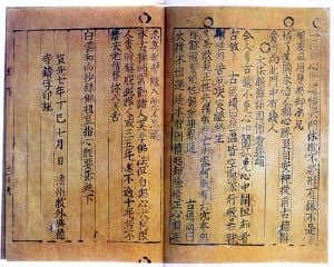
The techniques for bronze casting, used at the time for making coins (as well as bells and statues) were adapted to making metal type. Unlike the metal punch system thought to be used by Gutenberg, the Koreans used a sand-casting method. Among books printed with metal movable type, the oldest surviving books are from Korea, dated at least from 1377.
A potential solution to the linguistic and cultural bottleneck that held back movable type in Korea for 200 years appeared in the early fifteenth century—a generation before Gutenberg would begin working on his own movable type invention in Europe—when King Sejong devised a simplified alphabet of 24 characters called Hangul for use by the common people This made the typecasting and compositing process more feasible.
- Japan
Though the Jesuits operated a Western, movable type printing press in Nagasaki, Japan, printing equipment brought back by Toyotomi Hideyoshi's army in 1593 from Korea had far greater influence on the development of the medium. Four years later, Tokugawa Ieyasu, even before becoming shogun, effected the creation of the first native movable type, using wooden type-pieces rather than metal. He oversaw the creation of 100,000 type-pieces, which were used to print a number of political and historical texts.
An edition of the Confucian Analects was printed in 1598, using Korean movable type printing equipment, at the order of Emperor Go-Yōzei. This document is the oldest work of Japanese movable type printing extant today. Despite the appeal of movable type, however, it was soon decided that the running script style of Japanese writings would be better reproduced using woodblocks, and so woodblocks were once more adopted; by 1640 they were once again being used for nearly all purposes.
- Other East Asian countries
Printing using movable type spread from China during the Mongol Empire. Among other groups, the Uyghurs of Central Asia, whose script was adopted for the Mongol language, used movable type.
- Europe
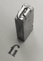
Johannes Gutenberg of Mainz is acknowledged as the first to invent a metal movable type printing system in Europe. Gutenberg was a goldsmith familiar with techniques of cutting punches for making coins from molds. Between 1436 and 1450 he developed hardware and techniques for casting letters from matrices using a device called the hand mould.[3] Gutenberg's key invention and contribution to movable type printing in Europe, the hand mold was the first practical means of making cheap copies of letterpunches in the vast quantities needed to print complete books, making the movable type printing process a viable enterprise.
Gutenberg and his associates developed oil-based inks ideally suited to printing with a press on paper, and the first Latin typefaces. Gutenberg's movable type printing system spread rapidly across Europe, from the single Mainz press in 1457 to 110 presses by 1480, of which 50 were in Italy. Venice quickly became the center of typographic and printing activity. Significant were the contributions of Nicolas Jenson, Francesco Griffo, Aldus Manutius, and other printers of late fifteenth century Europe.
Mechanical presses
Mechanical presses as used in European printing remained unknown in East Asia. Instead, printing remained an unmechanized, laborious process with pressing the back of the paper onto the inked block by manual "rubbing" with a hand tool. In Korea, the first printing presses were introduced as late as 1881 to 1883, while in Japan, after an early but brief interlude in the 1590s, Gutenberg's printing press arrived in Nagasaki in 1848 on a Dutch ship.
Contrary to Gutenberg printing, which allowed printing on both sides of the paper from its very beginnings (although not simultaneously until very recent times), East Asian printing was done only on one side of the paper, because the need to rub the back of the paper when printing would have spoiled the first side when the second side was printed. Another reason was that, unlike in Europe where Gutenberg introduced more suitable oil-based ink, Asian printing remained confined to water-based inks which tended to soak through the paper.
Typeface design
Medieval design roots
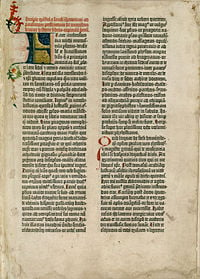
Typography, type-founding, and typeface design began as closely related crafts in mid-fifteenth century Europe with the introduction of movable type printing at the junction of the medieval era and the Renaissance. Handwritten letterforms of the mid-fifteenth century embodied 3000 years of evolved letter design, and were the natural models for letterforms in systematized typography. The scribal letter known as textur or textualis, produced by the strong gothic spirit of blackletter from the hands of German area scribes, served as the model for the first text types.
Johannes Gutenberg employed the scribe Peter Schöffer to help design and cut the letterpunches for the first typeface—the D-K type of 202 characters used to print the first books in Europe. A second typeface of about 300 characters designed for the Gutenberg Bible around 1455 was probably cut by the goldsmith Hans Dunne with the help of Götz von Shlettstadt and Hans von Speyer.
Cultural tradition ensured that German typography and type design remained true to the gothic/blackletter spirit; but the parallel influence of the humanist and neo-classical typography in Italy catalyzed textur into four additional sub-styles that were distinct, structurally rich, and highly disciplined: Bastarda, fraktur, rotunda, and Schwabacher.
The rapid spread of movable-type printing across Europe produced additional Gothic, half-Gothic, and Gothic-to-roman transitional types. Johann Bámler's Schwabacher, Augsburg appeared in 1474. The half-Gothic Rotunda type of Erhard Ratdolt from 1486 was cut to suit Venetian taste. In 1476, William Caxton printed the first books in England with a so-called Bâtarde type (an early Schwabacher design), but soon abandoned it.
Classical revival
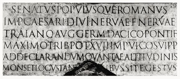
In Italy the heavy gothic styles were soon displaced by Venetian or "old style" Latin types, also called antiqua. The inscriptional capitals on Roman buildings and monuments were structured on a euclidean geometric scheme and the discrete component-based model of classical architecture. Their structurally perfect design, near-perfect execution in stone, balanced angled stressing, contrasting thick and thin strokes, and incised serifs became the typographic ideal for western civilization. The best-known example of Roman inscriptional capitals exists on the base of Trajan's Column, inscribed in 113.
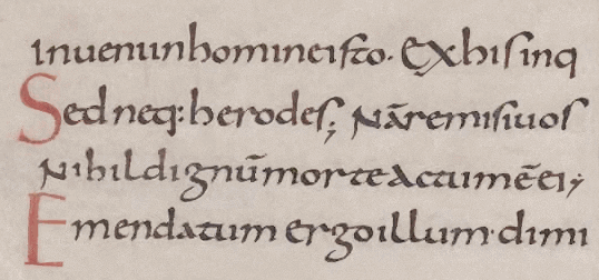
In their enthusiastic revival of classical culture, Italian scribes and humanist scholars of the early fifteenth century searched for ancient minuscules to match the Roman inscriptional capitals. Practically all of the available manuscripts of classical writers had been rewritten during the Carolingian Renaissance, and with a lapse of 300 years since the widespread use of this style, the humanist scribes mistook Carolingian minuscule as the authentic writing style of the ancients. Dubbing it lettera antica, they began by copying the minuscule hand almost exactly, combining it with Roman capitals in the same manner as the manuscripts they were copying.
Upon noticing the stylistic mismatch between these two very different letters, the scribes redesigned the small Carolingian letter, lengthening ascenders and descenders, and adding incised serifs and finishing strokes to integrate them with the Roman capitals. By the time movable type reached Italy several decades later, the humanistic writing had evolved into a consistent model known as "humanistic minuscule," which served as the basis for type style we know today as Venetian.
Transition from humanistic minuscule to roman type
The classically endowed city of Rome attracted the first printers known to have set up shop outside Germany, Arnold Pannartz and Konrad Sweynheim, closely followed by the brothers Johann and Wendelin of Speyer (de Spira), and the Frenchman Nicolas Jenson. They printed with types ranging from textur Gothic to fully developed romans inspired by the earlier humanistic writing, and within a few years the center of printing in Italy shifted from Rome to Venice.
Some time before 1472 in Venice, Johann and Wendelin issued material printed with a half-Gothic/half-roman type known as "Gotico-antiqua." This design paired simplified Gothic capitals with a rationalized humanistic minuscule letter set, itself combining Gothic minuscule forms with elements of Carolingian, in a one step forward, half step back blending of styles.
Around the same time (1468) in Rome, Pannartz and Sweynheim were using another typeface that closely mimicked humanistic minuscule, known as "Lactantius." Unlike the rigid fractured forms of Speyer's half-Gothic, the Lactantius is characterized by smoothly rendered letters with a restrained organic finish. The Lactantius "a" departed from both the Carolingian and Gothic models; a vertical backstem and right-angled top replaced the diagonal Carolingian structure, and a continuous curved stroke replaced the fractured Gothic bowl element.
Individual letters: Aa Bb Cc Dd Ee Ff Gg Hh Ii Jj Kk Ll Mm Nn Oo Pp Qq Rr Ss Tt Uu Vv Ww Xx Yy Zz
Roman type
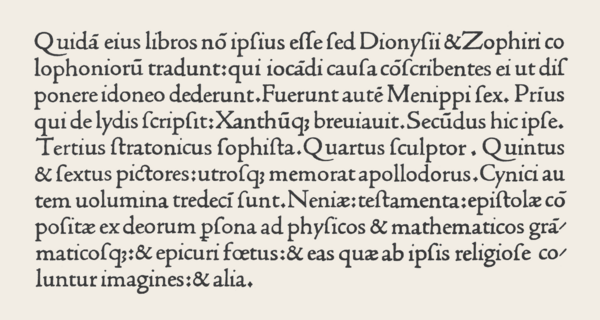
The name "roman" is customarily applied uncapitalized to distinguish early Jenson and Aldine-derived types from classical Roman letters of antiquity. Some parts of Europe call roman "antiqua" from its connection with the humanistic "lettera antica;" "medieval" and "old-style" are also employed to indicate roman types dating from the late-fifteenth century, especially those used by Aldus Manutius (Italian: Manuzio). Roman faces based on those of Speyer and Jenson are also called Venetian.
Nicolas Jenson began printing in Venice with his original roman font from 1470. Jenson's design and the very similar roman types cut by Francesco Griffo (1499) and Erhard Radolt (1486) are acknowledged as the definitive and archetypal roman faces that set the pattern for the majority of Western text faces that followed.
The Jenson roman was an explicitly typographic letter designed on its own terms that declined to imitate the appearance of hand-lettering. Its effect is one of a unified cohesive whole, a seamless fusion of style with structure, and the successful convergence of the long progression of preceding letter styles. Jenson adapted the structural unity and component-based modular integration of Roman capitals to humanistic minuscule forms by masterful abstract stylization. The carefully modelled serifs follow an artful logic of asymmetry. The ratio of extender lengths to letter bodies and the distance between lines results in balanced, harmonious body of type. Jenson also mirrors the ideal expressed in renaissance painting of carving up space (typographic "white space") with figures (letters) to articulate the relationship between the two and make the white space dynamic.
Italic type
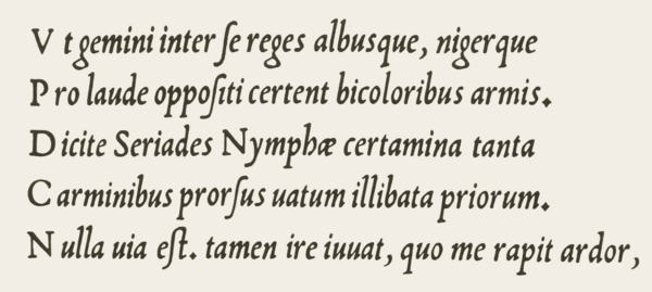
The humanist spirit driving the Renaissance produced its own unique style of formal writing, known as "cursiva humanistica." This slanted and rapidly written letter, evolved from humanistic minuscule and the remaining Gothic current cursive hands in Italy, served as the model for cursive or italic typefaces. As books printed with early roman types forced humanistic minuscule out of use, cursiva humanistica gained favor as a manuscript hand for the purpose of writing. The popularity of cursive writing itself may have created some demand for a type of this style. The more decisive catalyst was probably the printing of pocket editions of Latin classics by Aldus Manutius.
Around 1527, the Vatican chancellery scribe Ludovico Arrighi designed a superior italic type and had the punches cut by Lauticio di Bartolomeo dei Rotelli. The more modular structure of Arrighi's italic and its few ligatures made it less a copy of the cursive hand than Griffo's. Its slightly taller roman capitals, a gentler slant angle, taller ascenders, and wider separation of lines gave the elegant effect of refined handwriting.
Surviving examples of sixteenth century Italian books indicate the bulk of them were printed with italic types. By mid-century the popularity of italic types for sustained text setting began to decline until they were used only for in-line citations, block quotes, preliminary text, emphasis, and abbreviations. Italic types from the twentieth century up to the present are much indebted to Arrighi and his influence on French designers.
Swiss art historian Jakob Burckhardt described the classically inspired Renaissance modello of dual-case roman and cursive italic types as "The model and ideal for the whole western world."[4] Venetian pre-eminence in type design was brought to an end by the political and economic turmoil that concluded the Renaissance in Italy with the sack of Rome in 1527.
Beginnings of modern type
Baroque and rococo aesthetic trends, use of the pointed-pen for writing, and steel engraving techniques effected a gradual shift in typographic style. Contrast between thick and thin strokes increased. Tilted stressing transformed into vertical stressing; full rounds were compressed. Blunt bracketed serifs grew sharp and delicate until they were fine straight lines. Detail became clean and precise.
Transitional roman types combined the classical features of lettera antiqua with the vertical stressing and higher contrast between thick and thin strokes, characteristic of the true modern romans to come.
The roman types used around 1618 by the Dutch printing firm of Elzevir in Leyden reiterated the sixteenth-century French style with higher contrast, less rigor, and a lighter page effect. After 1647, most Elziver faces were cut by the highly-regarded Christoffel van Dyck, whose precise renditions were regarded by some experts at the time as finer than Garamond's.
- Fell types
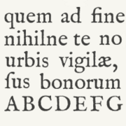
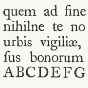
From mid-sixteenth century until the end of the seventeenth, interference with printing by the British Crown thwarted the development of type founding in England—most type used by seventeenth century English printers was of Dutch origin. The lack of material inspired Bishop of Oxford Doctor John Fell to purchase punches & matrices from Holland 1670–1672 for use by the Oxford University Press. The so-named Fell types, presumed to be the work of Dutch punch-cutter Dirck Voskens, mark a noticeable jump from previous designs, with considerably shorter extenders, higher stroke contrast, narrowing of round letters, and flattened serifs on the baseline and descenders.
- Caslon
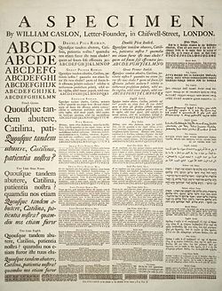
The first major figure in English typography is reckoned by type historians to have ended the monopoly of Dutch type founding almost single-handedly. The gun engraver-turned-punchcutter William Caslon spent 14 years creating the stable of typefaces on the specimen sheet issued in 1734. The complete canon included roman, italic, Greek, Hebrew, and Arabic. Caslon's Great Primer roman and English roman were retrogressive designs that very closely followed the Fell types and the roman of Miklós (Nicholas) Kis (1685) falsely attributed to Anton Janson.
William Caslon's prodigious output was influential worldwide. Caslon type and its imitations were used throughout the expanding British empire. It was the dominant type in the American colonies for the second half of the eighteenth century. Caslon marks the rise of England as the center of typographic activity.
- Fleischmann
Johann Michael Fleischmann (1701-1768) was born in Nürnberg where he trained as a punchcutter. He found employment with Dutch-type founders in Holland and settled there in 1728. At the Enschedé foundry in Haarlem he cut punches for a large amount of material. Some time after 1743, he produced a distinguished roman design—related to the preceding transitional types but departing from them.
Fleischman was held in great esteem by his contemporaries, his designs exerting a decisive influence in the last quarter of the eighteenth century. Renowned French punchcutter Pierre Simon Fournier (1712-1768), confessed to having copied Fleischman's design, and was first to dub "contrast" types like the Fells, Caslon, and Fleischman "modern." Fournier's rococo-influenced designs—Fournier and Narcissus—and his Modèles des Caractères (1742) continued the romaine du roi style and adapted it for his own modern age.
- Baskerville
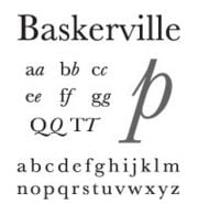
The roman and italic types of John Baskerville (1772) appeared later than Fleischman's but are considered transitional and partly retrogressive with a return to lower contrast, smooth transaxial modeling, finely modeled bracketed serifs, and long stems. The exquisite design and finish of Baskerville's roman however, combining elegance and strength, was modern. His roman design, and especially his italic, were rococo-influenced. His designs did not visibly quote any previous types. They were informed by his prior experience as a writing master and the influences of his time. The types of Joseph Fry, Alexander Wilson, and John Bell closely followed Baskerville, and through his correspondence with European type founders Baskerville's influence penetrated most of western Europe.
- Modern romans
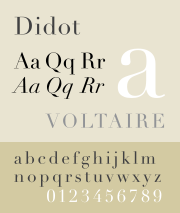
True modern romans arrived with the types of the Italian Giambattista Bodoni and the French Didots. Completing trends begun by the Fell types, Fleischman, Fournier, and Baskerville, the so-called "classical" modern romans eschewed chirographic and organic influences, their synthetic symmetric geometry answering to a rationalized and reformed classical model driven by the strict cartesian grid philosophy of René Descartes and the predictable clockwork universe of Isaac Newton.
The "classical" appellation of modern romans stems from their return to long ascenders and descenders set on widely-spaced lines, and a corresponding light page effect reminiscent of old-style—occurring at a time of classical revival. Bodoni was foremost in progressing from rococo to the new classical style. He produced an italic very close to Baskerville's, and a French cursive script type falling in between italic type and joined scripts. The roman types of Francois Ambroise Didot and son Firmin Didot closely resemble the work of Bodoni, and opinion is divided over whether the Didots or Bodoni originated the first modern romans.
Nineteenth and twentieth century typography
The nineteenth century brought fewer stylistic innovations. The most notable invention was the rise of typefaces with strengthened serifs. Forerunners were the so-called Eqyptienne fonts, which were used already at the beginning of the nineteenth century. Their name likely comes from the enthusiasm of the Napoleonic era for the Orient, which in turn was started by Napoleon's invasion in Egypt. In fact, slab-serif fonts (such as Clarendon from 1845) were newspaper fonts, whose serifs were strengthened in order to prevent damage during the printing process. Stylistically the serif fonts of the mid-nineteenth century appeared very robust and otherwise had more or less Neo-Classical design features, which changed during the course of time.
Above all, the nineteenth century was innovative regarding technical aspects. Automatic manufacturing processes changed the print as well as the graphical illustrations. The illustration of printed matters could be considerably standardized due to the lithography technique invented by Alois Senefelder. Finally, another invention was photography, whose establishment at the end of the century led to the first halftoning and reproduction procedures. The step-by-step development of a modern mass society provided a growing demand of printed matters. Besides the traditional letterpress beginnings of a newspaper landscape as well as a broad market for publications, advertisements, and posters of all kinds appeared. The challenges had changed: Since printing and typography had been a straightforward craft for centuries, it now had to face the challenges of a industry-ruled mass society.
- Hot type and phototypesetting
The 90 years between 1890 and 1980 coined typography until now. The craft of printing became an industry, and the typography became a part of it. Both stylistically and technologically this epoch was tumultuous. Significant developments included the following:
- The fabrication and application of typefaces more and more were affected by industrial manufacturing processes. Significant incidents were the invention of the hot type machine by Ottmar Mergenthaler (Linotype machine, 1886) and Tolbert Lanston (Monotype machine, 1887) and a few decades later the emergence of phototypesetting. The result: Compilation and typographical design of the text could be more and more controlled by keyboards in contrast to manual typesetting.
- A result of the industrialization process was the unimagined number and distribution of new typefaces. Whether digital variants of Garamond and Bodoni or new contemporary type designs like Futura, Times, and Helvetica: nearly all currently used typefaces have their origin either in the following and ongoing digital typesetting era or are based on designs of this epoch. The basis was the appearance of large type foundries and type manufacturers. The result: Successful typefaces could quickly gain the status of a trademark–and therefore were able to assign a unique "branding" to products or publications.
- Besides the traditional typography of a book's graphic design became a more or less independent branch. The tensions between those two branches significantly determined the stylistic development of twentieth century's typography.
- Art Nouveau and New Book Art
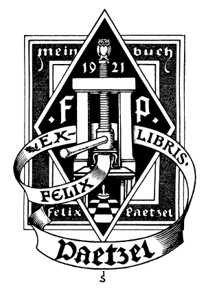
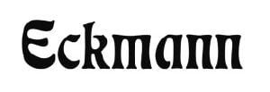
Since Impressionism the Modern Art styles were reflected in graphic design and typography too. Since 1890, Art Nouveau became popular. Its floral ornaments, the curved forms, as well as the emphasis on graphic realization inspired the type designers of the turn of the century. A popular Art Nouveau font was the Eckmann designed by graphic artist Otto Eckmann. Furthermore, the influence of Art Nouveau was expressed in book illustrations and exlibris designs.
Altogether the return to the roots of Book Art become stronger at the turn of the century. It was initiated by British typographer and private press publisher William Morris as well as by the Arts and Crafts Movement. Essentially this movement initiated three things—a return to the antiqua-models of the Renaissance, clarity and simplicity of book illustrations, and straightforward technical processes during the production of printed matters. An immediate consequence of the Arts and Crafts Movement was the establishment of the private-press movement, which more or less was committed to Morris' ideals, and whose remains partially are still present today.
Especially the New Book Art movement, which formed in the decade before World War I, was influenced by the Arts and Crafts Movement. The young type designers of the pre-war era, among them Fritz Helmuth Ehmcke and Friedrich Wilhelm Kleukens, rejected both the late typographical classicism and the ornaments of Art Nouveau. The new ideal became a tidy and straightforward book typography, which dedicated itself to the ideas of the Renaissance. Walter Tiemann in Leipzig, Friedrich Hermann Ernst Schneidler in Stuttgart, and Rudolf Koch in Offenbach as instructors were the mentors of this kind of typography. They stayed influential in the field of book typesetting until a long time after the end of World War II.
Text typography
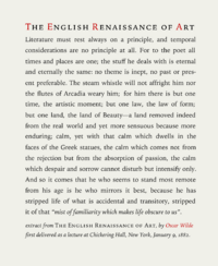
In traditional typography, text is composed to create a readable, coherent, and visually satisfying whole that works invisibly, without the awareness of the reader. Even distribution with a minimum of distractions and anomalies are aimed at producing clarity and transparency.
Choice of font(s) is perhaps the primary aspect of text typography—prose fiction, non-fiction, editorial, educational, religious, scientific, spiritual, and commercial writing all have differing characteristics and requirements. For historic material, established text typefaces are frequently chosen according to a scheme of historical genre acquired by a long process of accretion, with considerable overlap between historical periods.
Contemporary books are more likely to be set with state-of-the-art seriffed "text romans" or "book romans" with design values echoing present-day design arts. With their more specialized requirements, newspapers and magazines rely on compact, tightly fitted text romans specially designed for the task, which offer maximum flexibility, readability, and efficient use of page space. Sans serif text-fonts are often used for introductory paragraphs, incidental text, and whole short articles. A contemporary fashion is to pair sans-serif type for headings with a high-performance seriffed font of matching style for the text of an article.
The text layout, tone, or "color" of set matter, and the interplay of text with white space of the page and other graphic elements combine to impart a "feel" or "resonance" to the subject matter. With printed media typographers are also concerned with binding margins, paper selection, and printing methods.
Typography is modulated by orthography and linguistics, word structures, word frequencies, morphology, phonetic constructs, and linguistic syntax. Typography also is subject to specific cultural conventions. For example, in French it is customary to insert a non-breaking space before a colon (:) or semicolon (;) in a sentence, while in English it is not.
Display typography
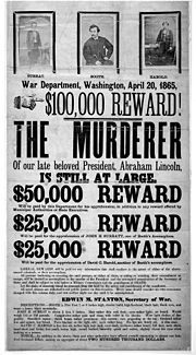
Display typography is a potent element in graphic design, where there is less concern for readability and more potential for using type in an artistic manner. Type is combined with negative space, graphic elements, and pictures, forming relationships and dialog between words and images. For example, the wanted poster for the assassins of Abraham Lincoln was printed with lead and woodcut type, and incorporates photography.
Color and size of type elements are much more prevalent than in text typography. Most display typography exploits type at larger sizes, where the details of letter design are magnified. Color is used for its emotional effect in conveying the tone and nature of subject matter.
Display typography encompasses: posters, book covers, typographic logos and wordmarks, billboards, packaging, on-product typography, calligraphy, graffiti, inscriptional and architectural lettering, poster design and other large scale lettering signage, business communications and promotional collateral, advertising, wordmarks, and typographic logos (logotypes), and kinetic typography in motion pictures and television, vending machine displays, online, and computer screen displays.
Advertising
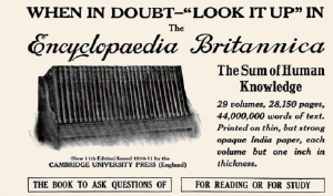
Typography has long been a vital part of promotional material and advertising. Designers often use typography to set a theme and mood in an advertisement; for example using bold, large text to convey a particular message to the reader. Type is often used to draw attention to a particular advertisement, combined with efficient use of color, shapes, and images. Today, typography in advertising often reflects a company's brand. Fonts used in advertisements convey different messages to the reader, classical fonts are for a strong personality, while more modern fonts are for a cleaner, neutral look. Bold fonts are used for making statements and attracting attention.
Notes
- ↑ Robert Bringhurst, The Elements of Typographic Style (Hartley & Marks, 1993, ISBN 0881791334).
- ↑ Thomas Christensen, Gutenberg and the Koreans: Did East Asian Printing Traditions Influence the European Renaissance? Arts of Asia, 2007. Retrieved January 25, 2009.
- ↑ Philip B. Meggs, A History of Graphic Design (John Wiley & Sons, Inc., 1998, ISBN 0471291986), 58–69.
- ↑ Jacob Burckhardt, The Civilization of the Renaissance in Italy (New York, NY: Random House, 2002, ISBN 978-0375759260).
References
ISBN links support NWE through referral fees
- Bringhurst, Robert. The Elements of Typographic Style. Vancouver, BC: Hartley & Marks, 1993. ISBN 0881791334.
- Heller, Steven, and Philip B. Meggs. Texts on Type: Critical Writings on Typography. New York, NY: Allworth Press, 2001. ISBN 1581150822.
- Man, John. The Gutenberg Revolution: The Story of a Genius that Changed the World. London: Headline Book Publishing, 2002. ISBN 0747245045.
- McKitterick, David. Print, Manuscript, and the Search for Order, 1450-1830. New York, NY: Cambridge University Press, 2003. ISBN 978-052182690X.
- Meggs, Philip B. A History of Graphic Design. John Wiley & Sons, Inc., 1998. ISBN 0471291986.
- Tsien, Tsuen-Hsuin. Science and Civilisation in China: Volume 5, Chemistry and Chemical Technology; Part 1, Paper and Printing. Cambridge, UK: Cambridge University Press, 1986. ISBN 978-0521086906.
- White, Alex W. Type in Use—Effective Typography for Electronic Publishing. New York, NY: W.W. Norton & Company, 1999. ISBN 0393730344.
External links
All links retrieved April 1, 2020.
Credits
New World Encyclopedia writers and editors rewrote and completed the Wikipedia article in accordance with New World Encyclopedia standards. This article abides by terms of the Creative Commons CC-by-sa 3.0 License (CC-by-sa), which may be used and disseminated with proper attribution. Credit is due under the terms of this license that can reference both the New World Encyclopedia contributors and the selfless volunteer contributors of the Wikimedia Foundation. To cite this article click here for a list of acceptable citing formats.The history of earlier contributions by wikipedians is accessible to researchers here:
The history of this article since it was imported to New World Encyclopedia:
Note: Some restrictions may apply to use of individual images which are separately licensed.
↧ Download as ZWI file | Last modified: 02/04/2023 02:09:53 | 107 views
☰ Source: https://www.newworldencyclopedia.org/entry/Typography | License: CC BY-SA 3.0
 ZWI signed:

 KSF
KSF