Date Picker
 From Handwiki
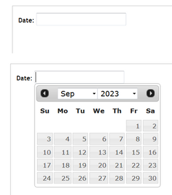
A date picker, popup calendar, date and time picker, or time picker is a graphical user interface widget which allows the user to select a date from a calendar and/or time from a time range. The typical practice is to provide a text box field which, when clicked upon to enter a date, pops up a calendar next to or below the field, allowing the user to populate the field with an appropriate date, or provides a text box with an icon of a calendar such that when the icon is clicked on, the calendar (or time field) appears, or show calendar widget directly (inline).
The date picker provides several advantages, including:
- allowing the user to enter a date by merely clicking on a date in the pop-up calendar as opposed to having to take their hand off the mouse to type in a date.
- validation of dates by restricting date ranges, e.g. only after today and for two weeks later, or only for dates in the past.
- a date range can be entered such that for a set of "from-to" date fields, if the "from" field is filled, the "to" field cannot be set to a date before the "from" field, or if the "to" field is filled, the "from" field cannot be set to a later date than the "to" field.
- can have a "today" button
- can customize the day the week begins on
- Only legal dates can be entered, e.g. February 29, 2100 can't be entered, nor could June 31.
- Date format confusion is eliminated, e.g. is 7/4/10 July 4, 2010, April 7, 2010, or April 10, 2007?
In the case of a time picker, many similar functions are available, such as ensuring the user
- Cannot enter an invalid time (25:18, 4:61).
- Cannot select an out of range time (6:00 pm for a business allowing customers to select their own appointments, but the business closes at 5:30), or during unattended times (like lunch).
- Cannot select an invalid range (can restrict selected time to the nearest 5, 10 or 15 minutes or any range, e.g. 2:30 or 2:45 is okay, but 2:37 is not.)
An example of a programmable date picker is shown in the documentation for the jQuery UI JavaScript user interface library at: http://jqueryui.com/datepicker/
 | This article uses only URLs for external sources. (2021) (Learn how and when to remove this template message) |
 | This article does not cite any external source. HandWiki requires at least one external source. See citing external sources. (2021) (Learn how and when to remove this template message) |
 |  |
Categories: [Graphical control elements]
↧ Download as ZWI file | Last modified: 07/19/2024 10:28:12 | 1 views
☰ Source: https://handwiki.org/wiki/Date_picker | License: CC BY-SA 3.0
 KSF
KSF