Pt Fonts
 From Handwiki
  | |
| Category | Font superfamily |
|---|---|
| Classification | Humanist sans-serif Transitional serif Monospaced font |
| Designer(s) | Alexandra Korolkova with Olga Umpelova and Vladimir Yefimov |
| Commissioned by | Rospechat |
| Foundry | ParaType |
| Date created | 2009 |
| Date released | 13 January 2010[1] |
| License | SIL Open Font License or ParaType Free Font License |
The Public Type or PT Fonts are a family of free and open-source fonts released from 2009 onwards, comprising PT Sans, PT Serif and PT Mono. They were commissioned from the design agency ParaType by Rospechat, a department of the Russian Ministry of Communications, to celebrate the 300th anniversary of Peter the Great's orthography reform and to create a font family that supported all the different variations of Cyrillic script used by the minority languages of Russia, as well as the Latin alphabet.[1][2]
Primarily designed by Alexandra Korolkova, the family includes sans-serif and serif designs, both with caption styles for small-print text, and a monospaced font for use in programming. They are available under the English-language SIL Open Font License; the original font, PT Sans, was also released under ParaType's own Free Font License, and regular and bold with italics is free in Google.[clarification needed][3] Additional styles, such as extended, condensed and extra-bold, are sold from ParaType as PT Sans Pro and PT Serif Pro.[4][5]
Features
The fonts include Latin and Cyrillic characters and covers almost all minority languages of the Russian Federation. The slashed-Р ruble symbol (before it became official in December 2013) is included at the U+20B9…U+20CF code points.
In the most common open-source release, PT Sans and PT Serif feature regular, italic, bold and bold italic designs. They also include a caption style: this is a wider version of the typeface with a greater x-height (taller lower-case letters), designed for legibility at small font sizes and on outdoor signs. PT Sans also includes a condensed version in regular and bold without italics. In caption styles, PT Serif has a caption italic style while PT Sans has a bold version. PT Mono includes regular and bold styles.
Commercial releases include for PT Sans additional light, demi-bold, extra bold and black weights, in regular, narrow, condensed and extra-condensed styles. PT Serif gains an additional 32 styles, with narrow and extended widths, black, extra-bold and demi-bold weights. The professional releases also add text figures and small caps.
Inclusion in operating systems
PT Sans is included in the Fedora Linux package repository since February 2010,[7] in the Gentoo Linux repository since January 2011,[8] and in macOS since OS X Lion.[9]
PT Astra fonts

In 2016, PT Astra Sans and PT Astra Serif fonts were developed for distribution with the Russian Astra Linux operating system. Both fonts are metrically compatible with Times New Roman.[10][11][12]
In 2021, the PT Astra Fact font was developed for Astra Linux. Based on a design inspired by Frutiger,[13] it is metrically compatible with Verdana. The need for domestic replacements came about as a result of sanctions preventing fonts from Monotype Imaging from being supplied with Astra Linux.[14]
Gallery
-
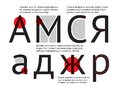 PT Sans features
 -
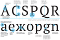 PT Serif features
 -
 PT Serif features
 -
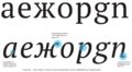
 PT Serif cyrillic (top) and latin (bottom) letters difference
 -
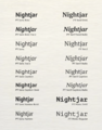 The open-source weights of the PT font series


.svg)
See also
- Open-source Unicode typefaces
- Cantarell, the default typeface in past versions of GNOME
- Droid (typeface), the default fonts for first versions of Android
- Noto fonts, the default fonts for newer versions of Android
- Open Sans, another font based on Droid Sans
- Roboto, the default fonts for newer versions of Android
- IBM Plex, free and open-source fonts from IBM
- National Fonts, free and open-source Thai fonts
- STIX Fonts project, typefaces intended to serve the scientific and engineering community
References
- ↑ 1.0 1.1 "Error: no
|title=specified when using {{Cite web}}" (in ru). Vesti. 2010-01-13. http://www.vesti.ru/doc.html?id=335519&cid=7.Error:+no+|title=+specified when+using+ - ↑ "Error: no
|title=specified when using {{Cite web}}" (in ru). Rossiyskaya Gazeta. 2010-01-14. http://www.rg.ru/2010/01/14/shrift.html.Error:+no+|title=+specified when+using+ - ↑ "New version of PT Sans". 2010-04-02. http://www.paratype.com/cinfo/news.asp?NewsId=318.
- ↑ "PT Sans Pro". https://www.myfonts.com/fonts/paratype/pt-sans-pro/.
- ↑ "PT Serif Pro". https://www.myfonts.com/fonts/paratype/pt-serif-pro/.
- ↑ "Ruble symbol". 2013-12-11. http://cbr.ru/today/?prtid=voterub.
- ↑ "Bug 556308 - Review Request: paratype-pt-sans-fonts - A pan-Cyrillic typeface". https://bugzilla.redhat.com/show_bug.cgi?id=556308.
- ↑ "Gentoo Bug 314503 - media-fonts/pt-sans (new package)". http://bugs.gentoo.org/show_bug.cgi?id=314503.
- ↑ "OS X Lion default fonts". https://discussions.apple.com/thread/3476342?start=0&tstart=0.
- ↑ "ПараТайп Новости - Информация о новых гарнитурах и о различных шрифтовых событиях" (in ru). https://www.paratype.ru/cinfo/news.asp?NewsId=3469.
- ↑ "PT Astra Sans" (in ru). https://www.paratype.ru/fonts/pt/pt-astra-sans.
- ↑ "PT Astra Serif" (in ru). https://www.paratype.ru/fonts/pt/pt-astra-serif.
- ↑ "Fact Font". https://www.paratype.com/fonts/pt/fact?tab=description.
- ↑ "Россияне создали замену знаменитому американскому шрифту, который недавно вычистили из ГОСТов" (in ru). 2021-06-07. https://www.cnews.ru/news/top/2021-06-04_rossiyane_sozdali_zamenu.
External links
- No URL found. Please specify a URL here or add one to Wikidata.
- The post in the official ParaType blog announcing PT Sans and telling the story of the project (in Russian)
- Alexandra Korolkova interview
macOS typefaces | |
|---|---|
| Latin, Greek, Cyrillic |
|
| Non-alphabetic | |
 |  |
Categories: [Unified serif and sans-serif typeface families] [Open-source typefaces] [Monospaced typefaces] [Latin-script typefaces] [Cyrillic typefaces]
↧ Download as ZWI file | Last modified: 06/10/2026 12:58:50 | 6 views
☰ Source: https://handwiki.org/wiki/PT_Fonts | License: CC BY-SA 3.0